This time, we will explore layout, one of the concepts and key elements you need to understand to create attractive designs. We will look at what to consider when creating a layout and how to handle those considerations.
Layout refers to arranging elements such as shapes and text in a design. Effectively conveying the intended message and attracting visual interest are what make a design attractive and a layout successful.
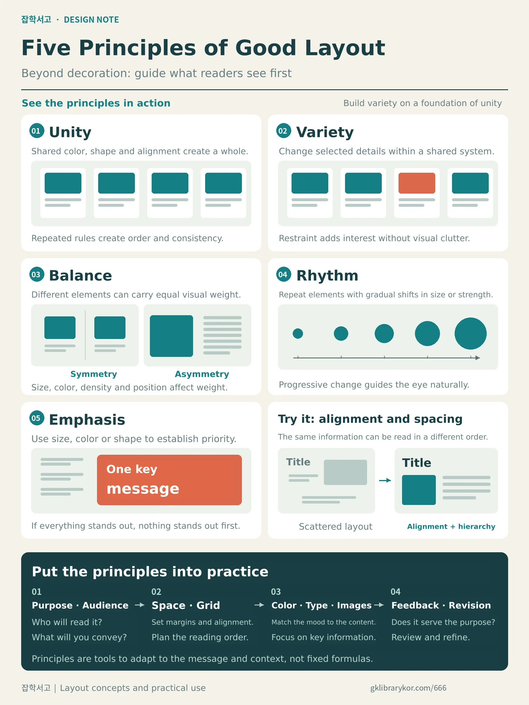
First, we will look at unity, variation, balance, rhythm, and emphasis, the principles that make up a layout, and then introduce the process of applying layout within the overall workflow.
Concepts of Layout Composition
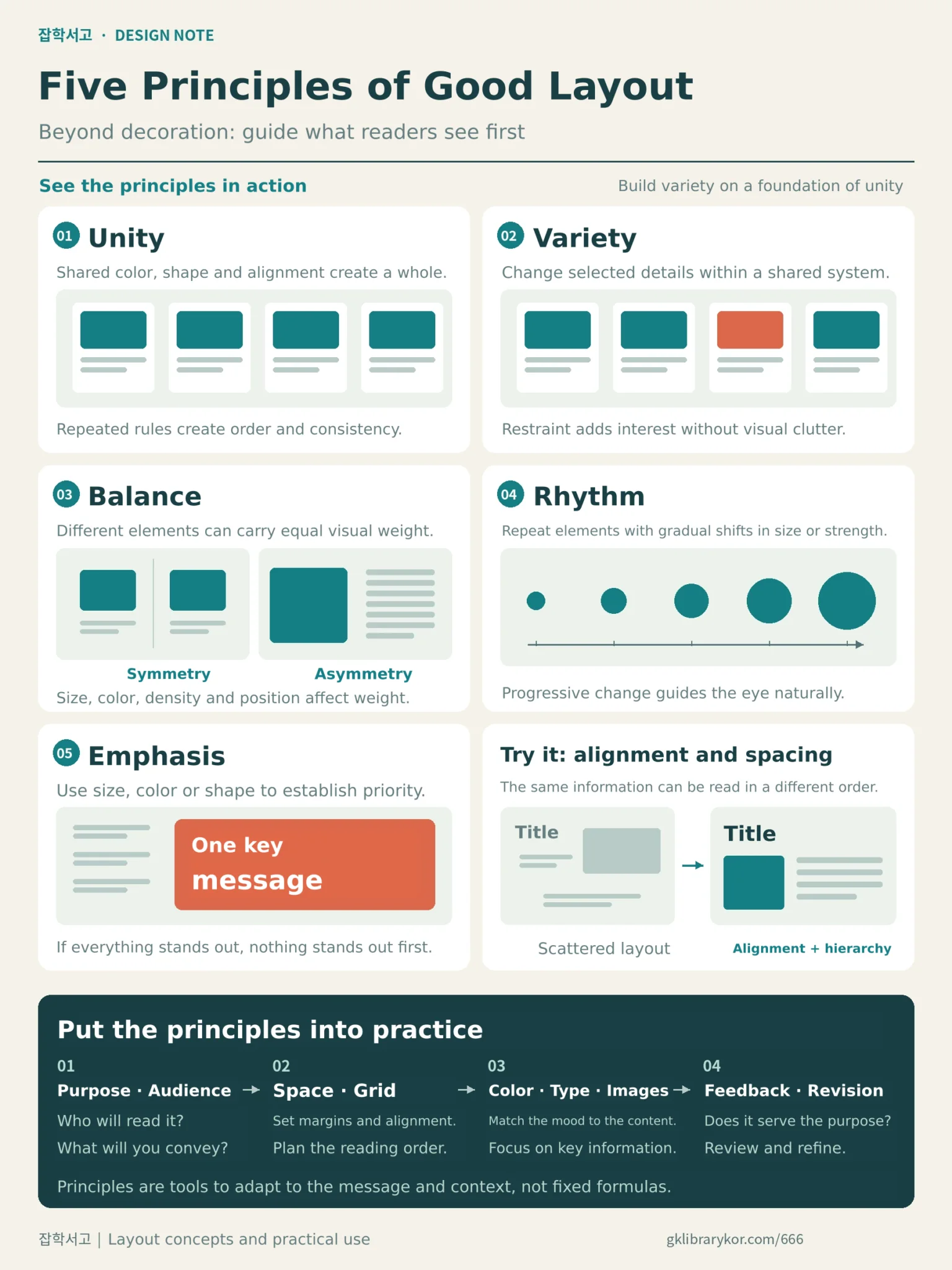
 What should you consider when creating a layout?
1) Unity
Unity means that the various elements arranged on the screen should be consistent and appear as a whole when viewed together. Each element should be balanced in an orderly and harmonious way, which requires repetition in objects, shapes, text, and other elements, as well as harmony in colors and other features.
However, emphasizing unity too much can make a design feel bland and visually uninteresting, so you should introduce appropriate variation while maintaining unity.
2) Variation
The main purpose of unity is to convey a message accurately through a stable sense of order, while variation adds interest to a layout. The most important thing is to add visual interest with restraint while maintaining appropriate harmony with unity.
Be careful, as overly strong variation can make a layout look confusing and cluttered.
3) Balance
Balance can be divided into symmetrical and asymmetrical forms. A symmetrical layout divides the screen into two halves and creates balance by using the same pattern on the left and right. It is easy to arrange and can create an orderly sense of unity, but its conservative, monotonous appearance makes it difficult for viewers to find it interesting.
An asymmetrical layout has different arrangements on the left and right, unlike a symmetrical layout, but the concept requires visual balance even when different objects are used.
In other words, both sides should have the same visual weight; if one side contains a great deal of text, you can balance the two sides by placing a large image or an image with prominent colors on the other side. The success of an asymmetrical design depends on the designer's visual sensibility, so it requires advanced techniques and experience.
4) Rhythm
Rhythm brings life to a design with a sense of unity. It refers to varying the visual strength of elements arranged on the screen, gradually changing their sizes, and movements in which elements repeat with continuity. Because this element acts like a seasoning in design, leaving it out entirely can make a design feel stagnant and awkward.
5) Emphasis
Emphasis is the concept used to make a message clear within a given space by making a particular element more prominent so that it stands out distinctly from the others. As mentioned when discussing the other concepts, it is also important to consider how harmoniously the individual objects are arranged.
Emphasis can mainly be achieved through differences in size, color, and shape, making visual effects and clear communication of the message possible. However, be careful, as too many emphasized elements can dilute the impact and have the opposite effect.
Layout Methods and Tips
1) Define the Purpose and Audience of the Layout
 Who will see it, and what will you communicate?
For a successful layout, you need to clearly define its purpose and audience before you begin. The points that need emphasis vary depending on the content you are working with and the design you are creating.
When creating educational content, make sure the hierarchy and structure of the information are clearly visible; when creating promotional content, emphasize the message and images you want to convey.
You also need to clearly understand the age, gender, and interests of the people who will see the design so you can choose colors and fonts accordingly.
2) Make Appropriate Use of Space and Proportion
 How will you arrange elements within a limited space?
The space available for a layout is not unlimited. Whether on a printed page or a screen, objects must be arranged within a defined area, so you need to think carefully about how to use that space efficiently and harmoniously.
Concepts you can use for this include allowing appropriate white space, arranging the layout according to a grid, and aligning elements with the visual flow in mind.
White space gives viewers a visual break, improving readability and creating a sense of unity. A grid divides the space horizontally and vertically to help arrange objects harmoniously, giving them structure and balance. Finally, alignment controls where objects are positioned to help viewers focus on the information.
Proportion is another factor to consider when arranging objects in a layout, and applying the golden ratio appropriately can by itself create an effective arrangement. The golden ratio is 1:1.618, and an approximate example using other whole numbers would be 5:8.
3. Choose Colors and Fonts Carefully
 What mood do you want to express?
In design, the use of color and fonts is a very important factor in determining the mood and impression. Colors should be used deliberately after you first gain some familiarity with color theory and understand the image each color conveys.
For example, warm colors create a friendly, lively feeling, while cool colors convey a calm, trustworthy image. The same applies to fonts: sans serif typefaces create a modern, concise impression, while serif typefaces create an elegant, emotionally expressive impression.
Separate resources on color and typography are provided below, and reading them alongside this resource on layout will be useful.
 Methods for Combining Colors
 Typography Thumbnail
4. Use Images and Graphics Effectively
 What do you want to emphasize and convey?
Images and graphics are also effective elements for supplementing or emphasizing information in a design. Using high-quality images that relate to the topic can support other objects or messages and help viewers understand them more easily through association.
To do this, you should also be prepared to put considerable effort into selecting suitable photos or backgrounds and creating or choosing elements such as icons, shapes, and charts. Adding these images and graphics can make the intended message and objects stand out more and communicate a variety of moods and emotions.
However, because preparing images and graphics takes a lot of time, opting to obtain them easily online can readily lead to copyright issues, so it is a good idea to familiarize yourself with sites offering copyright-free resources and use them when needed.
5. Learn and Apply the Layout Composition Concepts Mentioned Earlier
 Repeated practice is needed to apply them in real situations.
This resource introduced unity, variation, balance, rhythm, and emphasis as concepts of layout composition, and you should go beyond learning the theory by practicing their application in real situations until they become familiar.
Because design comes from experience and sensibility, ideas will not come easily unless these concepts become second nature, and you will spend more time struggling with the creative process.
6. Keep Seeking Feedback and Making Revisions
 Let's improve the quality through feedback.
Because design is subjective, it is difficult to produce a highly polished result in a single attempt. However, it is an area where you can improve through repeated feedback and revision, and you need a mindset that allows you to listen to other people's assessments and opinions without fearing this process.
Listen carefully to feedback with your design's purpose and audience in mind, and when revising, adjust the layout step by step based on that feedback and design principles.
We have now explored the concepts, principles, and methods for composing a layout to create attractive designs. At the level of the word itself, layout is about how to 'arrange' things, but you should remember that the way you arrange them makes a clear difference to visual beauty and the communication of information. I hope that harmoniously combining the layout concepts in this resource with the concepts of color, typography, and other topics in the linked resources will help you produce beautiful designs.