This time, I would like to write about typography design, which requires consideration of how to make lettering beautiful while also conveying its content effectively. We will look at the basic elements of typography design and the points that need to be considered.
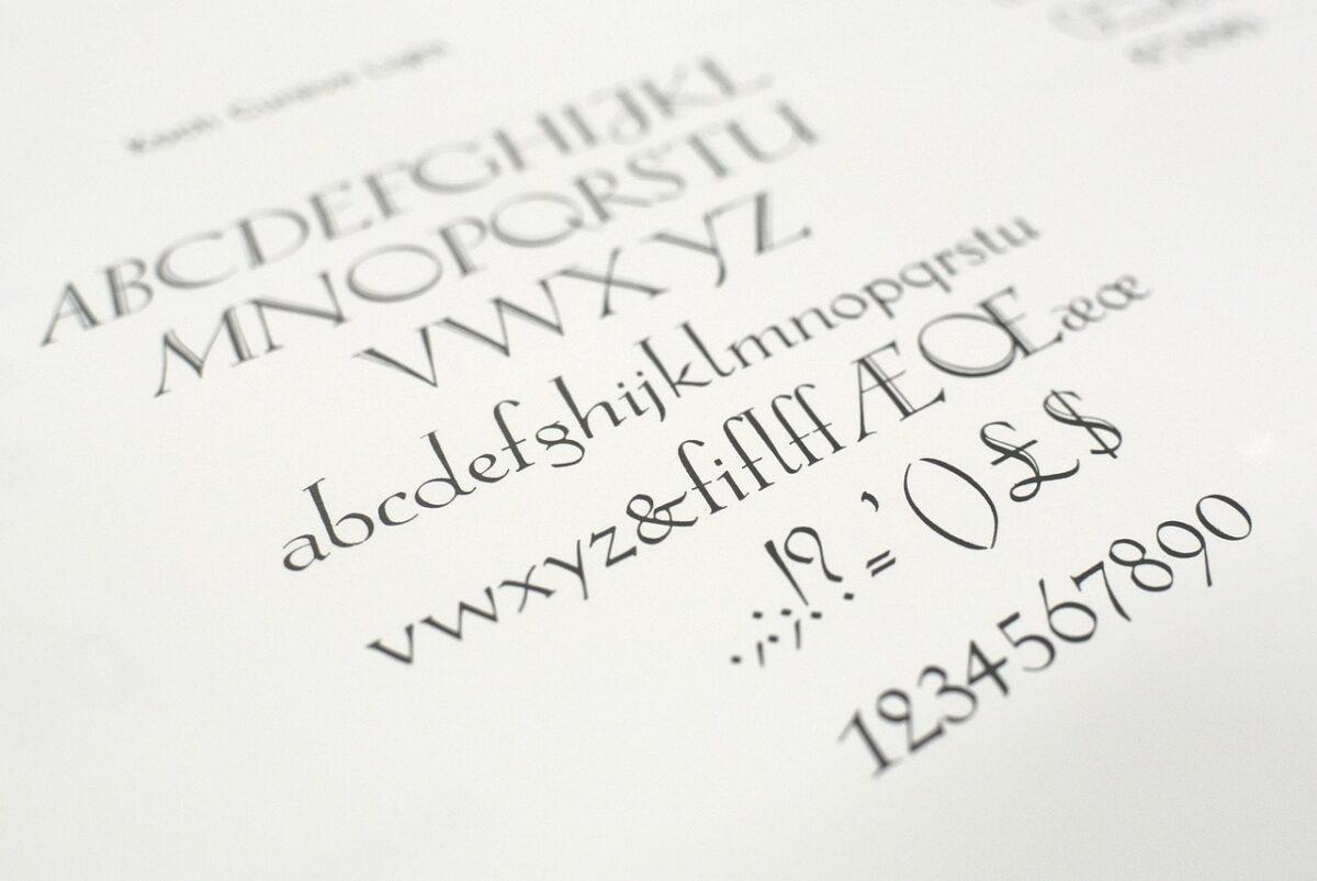 Typography is evolving day by day.
Typography design is a detailed field that requires careful consideration of visual elements, readability, legibility, attributes, and components, rather than simply writing out letters and decorating them however you please.
It is also a subjective field that can look different to different viewers, but this becomes easy to understand when you look at work produced by a skilled person and by someone trying it for the first time. For example, comparing broadcast titles used before the 90s with recent broadcast titles will make the advances in graphics and designers' visual judgment clearly apparent.
Let us first look at the elements that make up typography.
Typography Design Elements
 Elements of Typography Design
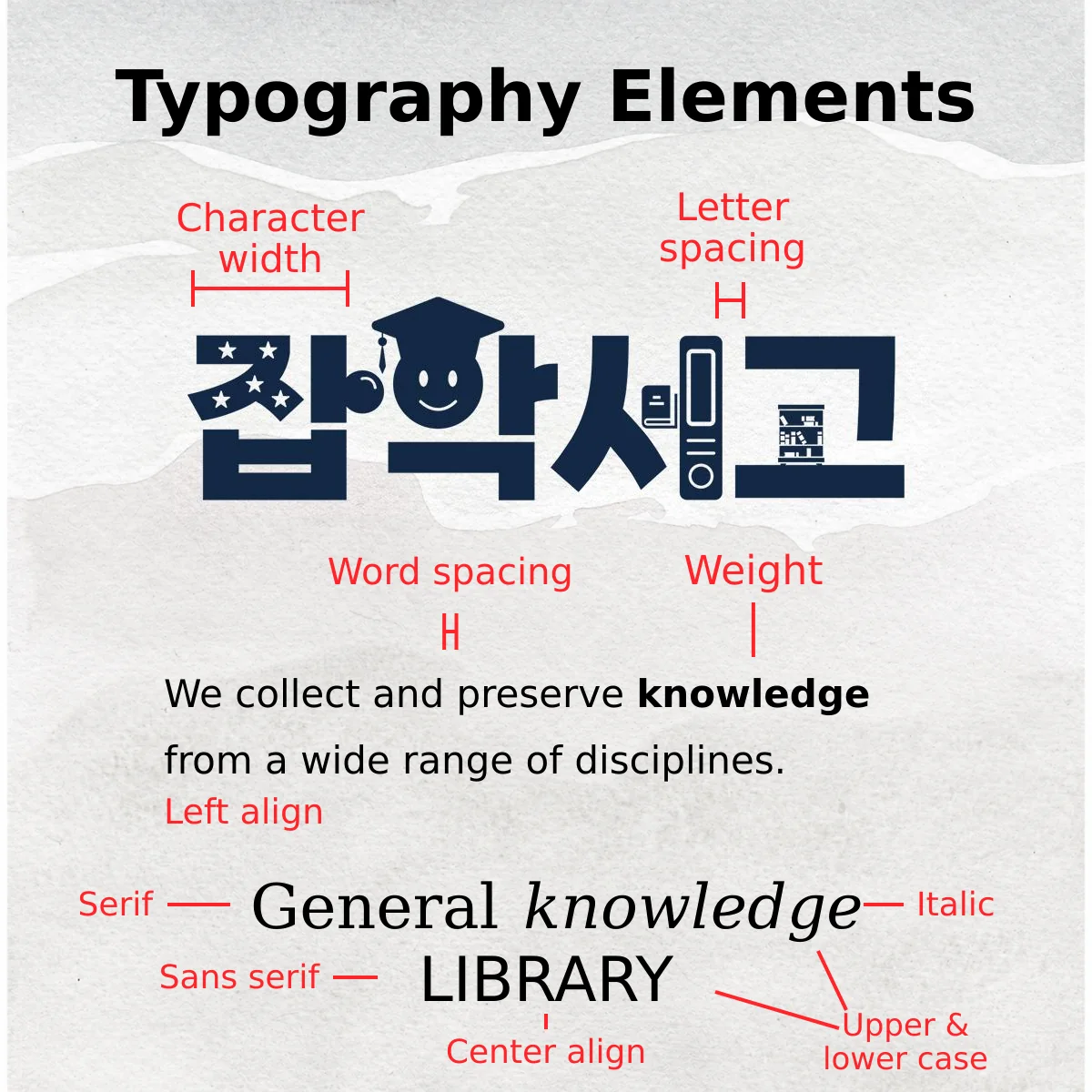
The main elements of typography include character width, letter spacing, word spacing, weight, italics, uppercase and lowercase letters, serif and sans serif, and alignment. I would like to briefly examine these elements one by one.
First, character width(the width of a character) refers to the horizontal width of each individual character. The key is usually whether there is enough room in the allotted space: wide characters are used when there is plenty of room, and narrow characters when room is limited. It shapes the impression the letters make and affects their visual weight and prominence.
Letter spacing refers to the spacing between individual letters (characters). It is also an element that determines the overall impression of the text. Tighter letter spacing makes the text feel darker, while wider spacing makes it feel brighter. But this applies only when the spacing is moderate! Spacing that is too wide or too narrow reduces readability, whereas finding appropriate spacing through experimentation improves readability.
Word spacing refers to the spacing between words. It defines the separation between words and adds an overall sense of rhythm. However, word spacing that is too wide breaks the continuity of the reader's gaze, while spacing that is too narrow makes the words hard to distinguish and their meaning difficult to understand.
Weight refers to the thickness of the text and determines the visual weight of the letters. If the letters are too thick, the space around them shrinks, reducing legibility, while letters that are too thin are difficult to distinguish from the background, reducing readability. The concepts of readability and legibility will be explained further later.
Italic type refers to letters slanted to the right, and requires care in use because it generally has the effect of reducing readability. It is usually used to make particular letters stand out.
Uppercase & Lowercase apply to typography in English. In general, lowercase letters are effective when there are many characters, while uppercase letters work well when there are fewer characters and you want individuality or emphasis in the design. Uppercase letters can look attractive, but they are more difficult to use in terms of readability.
Serif & Sans Serif refer to the distinction between letters with protrusions at their ends and those without. Letters with these protrusions are serif, and those without are sans serif. When comparing them with Korean typefaces, it may be a little easier to understand serif as the Myeongjo family and sans serif as the Gothic family. Serif is known for high readability, but from a design perspective, sans serif offers more flexibility and is easier to style.
Alignment refers to which side the text is arranged toward. In general, people are visually accustomed to left alignment because they read text from left to right. Right alignment can be used for short passages, but care is needed because using it poorly can confuse the reader.
Justified alignment is used for sentences with a very large number of characters and is widely used in media such as books, newspapers, and magazines. Center alignment can be used when there are few characters, and when used well, it can create a refined impression. Asymmetry adds a creative impression and has a lively, experimental character. This is also used when there are few characters.
Considerations in Typography Design
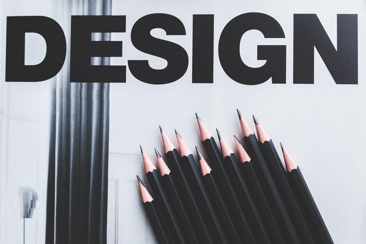 What should you think about when designing typography?
There are points to consider when applying typography in practice based on the elements described above. To outline the main categories first, these include readability and legibility, font consistency, space and white space, color, location (position), and texture. Let us examine these one by one as well.
Readability and legibility determine whether letters can be easily understood. Readability refers to how easily viewers can understand and read the text, while legibility refers to whether the outward shapes of the letters are easy to recognize.
Readability needs particular consideration when there are many characters, while legibility, in situations with few characters such as logos and titles, involves considering how strongly the visual elements can make an impression on the viewer in a short time.
Elements related to readability include uppercase and lowercase letters, serif and sans serif, font thickness, and color, while legibility is strongly influenced by font choice, letter thickness, whether uppercase and lowercase letters are mixed, and letter spacing.
Font consistency refers to how consistent and uniform your chosen font is. It is important to maintain shared characteristics across the overall design, and consistency is not a feature that stands out independently but a concept akin to a rule that must be upheld while using the other elements.
Space and white space refer to how much of the allotted space the text will occupy. When letters or shapes occupy a large amount of space, they can create a dominant impression.
White space is usually important when there are many characters, and it is an element that should always receive additional consideration because it reduces viewers' visual fatigue. Thinking about why people commonly use the expression 'the beauty of empty space' will help you understand.
Color determines how to emphasize the message conveyed through typography and add aesthetic elements. There are resources on color schemes and psychology below that may be helpful to consult.
 Color Scheme Methods
Position refers to where the typography is placed within the space. The closer it is to the center, the more confident an impression it gives, but placement too close to the center can feel static in some situations, so it is a good idea to try different positions and test them.
If the letters overlap an edge or extend beyond it, they look awkward and insubstantial, so take care not to push them too far toward the edges.
Texture is also a finishing touch in typography. It influences whether the letters look rough or delicate, and when used well, it creates a refined impression, but excessive use reduces readability.
This concludes the introduction to the elements and considerations you should know when designing typography. There are quite a few things to consider, so learning them thoroughly and being able to quickly recall them when needed will allow you to work efficiently.