When you design or put together materials such as PPT slides, you often end up using color. This time, I want to create and share some material that will be useful to know for such situations. In fact, anyone can easily start using color, but making it look good is a very difficult thing. If you overuse color or express too little, it is easy for the result to look shabby or bland.
So, to use color in a way that looks polished, you need to be good at combining colors, and this article deals with exactly that. Before looking at the characteristics of color schemes, it will help even more if you first understand the characteristics and principles of each color.
<Related material on color psychology>
 The psychology and characteristics of color
In this article, I divide the feelings that can be expressed through color schemes into nine types and, for each, summarize the colors to use, the colors to avoid, and points to keep in mind when combining colors, so that it is a little easier to follow.
※ Clear (clean, pure, fresh, simple)
 Clean color scheme
Source: GK Library palette examples. Impressions vary by context.
★ Colors to use
- Light blues and greens
- White (emphasizes cleanliness)
- Light gray (softness)
★ Colors to avoid
- Avoid dull colors with low saturation.
★ Tips for combining colors
* High-value, medium-saturation schemes
- These show a unified and stable contrast. They create a clean, crisp mood, and using medium saturation well lets you express a mood with strong and weak accents. They are easy on the eyes.
※ Tender (gentle, soft, calm, composed)
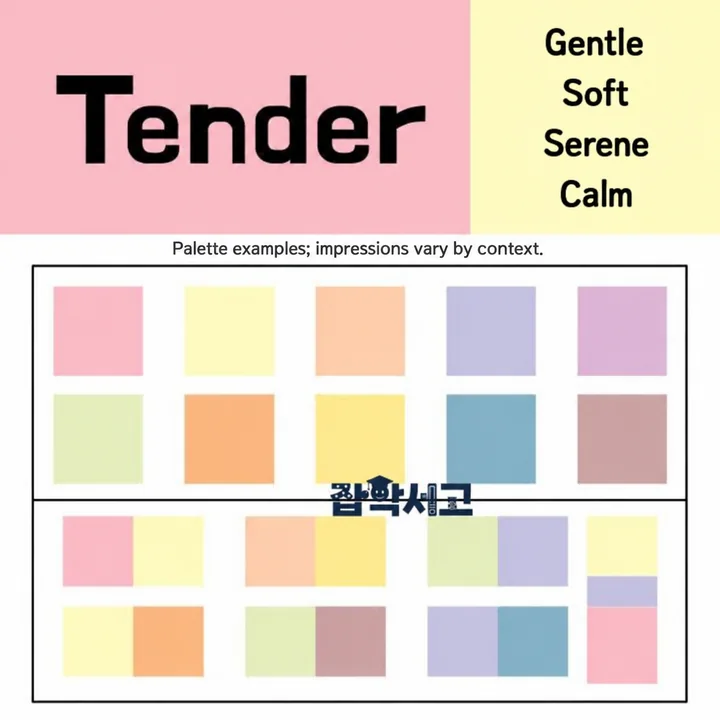 Gentle color scheme
Source: GK Library palette examples. Impressions vary by context.
★ Colors to use
- Tint (pale) colors
- Light tones
- Weak contrast
- Low-value schemes (calm, gentle)
- Gray (soft, composed)
★ Colors to avoid
- Avoid strong color contrast.
★ Tips for combining colors
* High-value, low-saturation schemes
- These are tint colors. They are gentle and soft, harmonious and stable. Using a primary color or a low-value color in one part lets you add contrast and a focal point.
* Schemes with small differences in hue
- Combine colors from similar or the same color families. The overall result is harmonious and balanced. When the difference in value is small, the scheme feels soft, supple, calm, and stable.
※ Natural (human, natural, nature-like, comfortable)
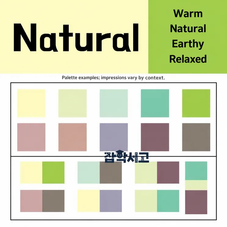 Natural color scheme
Source: GK Library palette examples. Impressions vary by context.
★ Colors to use
- Soft yellows and greens (e.g., ivory, beige)
- Schemes in medium tones
- Browns
★ Colors to avoid
- Avoid strongly contrasting primary colors.
★ Tips for combining colors
* Low-saturation three-color schemes
- These draw little attention and can give a calm, stable image.
※ Active (energetic, dynamic, speedy, lively, bold, intense)
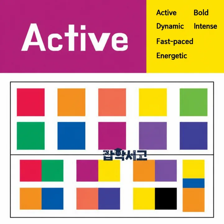 Energetic color scheme
Source: GK Library palette examples. Impressions vary by context.
★ Colors to use
- Highly saturated warm colors
- Blue, purple (energetic)
- Orange (attention, emphasis)
- High saturation: complementary contrast
- White and black schemes (tension)
★ Colors to avoid
- Avoid schemes with equal value and low-saturation colors.
★ Tips for combining colors
* High-saturation three-color schemes
- Red, blue, and yellow are the classic example. They show strong contrast and draw visual attention. This is a primary-color scheme and works well for guiding the viewer’s eye.
* Complementary schemes with a large difference in value
- These show strong contrast and are highly eye-catching and legible. They give a light, clear-cut image, and the contrast of vivid colors adds a sense of fun.
* Accent colors on a bright scheme
- Adding a low-value point to a high-value or high-saturation background, or a high-saturation accent to a plain, bright background, creates a focal point that strongly draws the eye and produces visual tension and excitement.
※ Casual (casual, cheerful, free, clear-cut, speedy, energetic, fun)
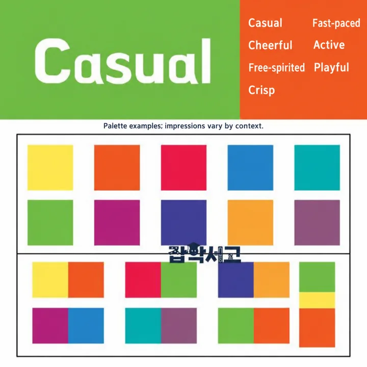 Cheerful color scheme
Source: GK Library palette examples. Impressions vary by context.
★ Colors to use
- Flashy, bright colors
- 2–3 colors
- Bright, vivid colors
- Schemes with white (light, fresh)
★ Colors to avoid
- Avoid dark or dull colors.
★ Tips for combining colors
* Chromatic accent colors
- These stimulate the eye through saturation contrast and complementary contrast. They are highly eye-catching and highly visible.
* Schemes with large differences in hue
- As above, use complementary colors and strong contrast. The greater the difference, the more eye-catching and legible the result. High-saturation contrast between pure hues gives an even more vivid and intense impression.
* Separation schemes applied with multiple colors
- These separate the images of colors or keep colors under control. They add contrast and vitality to an image. They can also make a simple image richer and more colorful. However, they can easily look cluttered, so combine colors carefully.
* Separation schemes using high value
- Because the visual contrast is strong, using white or a high-value separation color makes the scheme clear and light. In a low-saturation scheme, adding white raises the overall value and creates a contrast effect.
* Complementary schemes with a small difference in value
- Red, blue, and green are the classic example. They feel colorful but do not draw the eye. Adding white provides contrast and emphasis and makes the scheme visually stable.
* Separation schemes applied with a single color
- These clearly separate the boundaries between colors. They make the image look clear-cut and organized and can produce the strongest visual attention effect.
※ Classic (classic, traditional, timeless, stable, conservative)
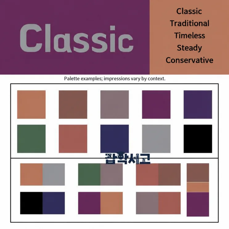 Traditional color scheme
Source: GK Library palette examples. Impressions vary by context.
★ Colors to use
- Browns, yellow, dark gray
- Deep, dark tones
- Dark brown and purple schemes (emphasize a luxurious, classic feel)
★ Tips for combining colors
* Separation schemes using low value
- Lowering the value and saturation of the whole image creates a stable, calm mood. Adding a low-value color to a high-saturation scheme can blend the flashy image into a harmonious contrast. Using black or dark gray in a high-value complementary scheme makes the contrast clearer and gives an even stronger impact.
※ Elegant (delicate, graceful, feminine softness, mysterious)
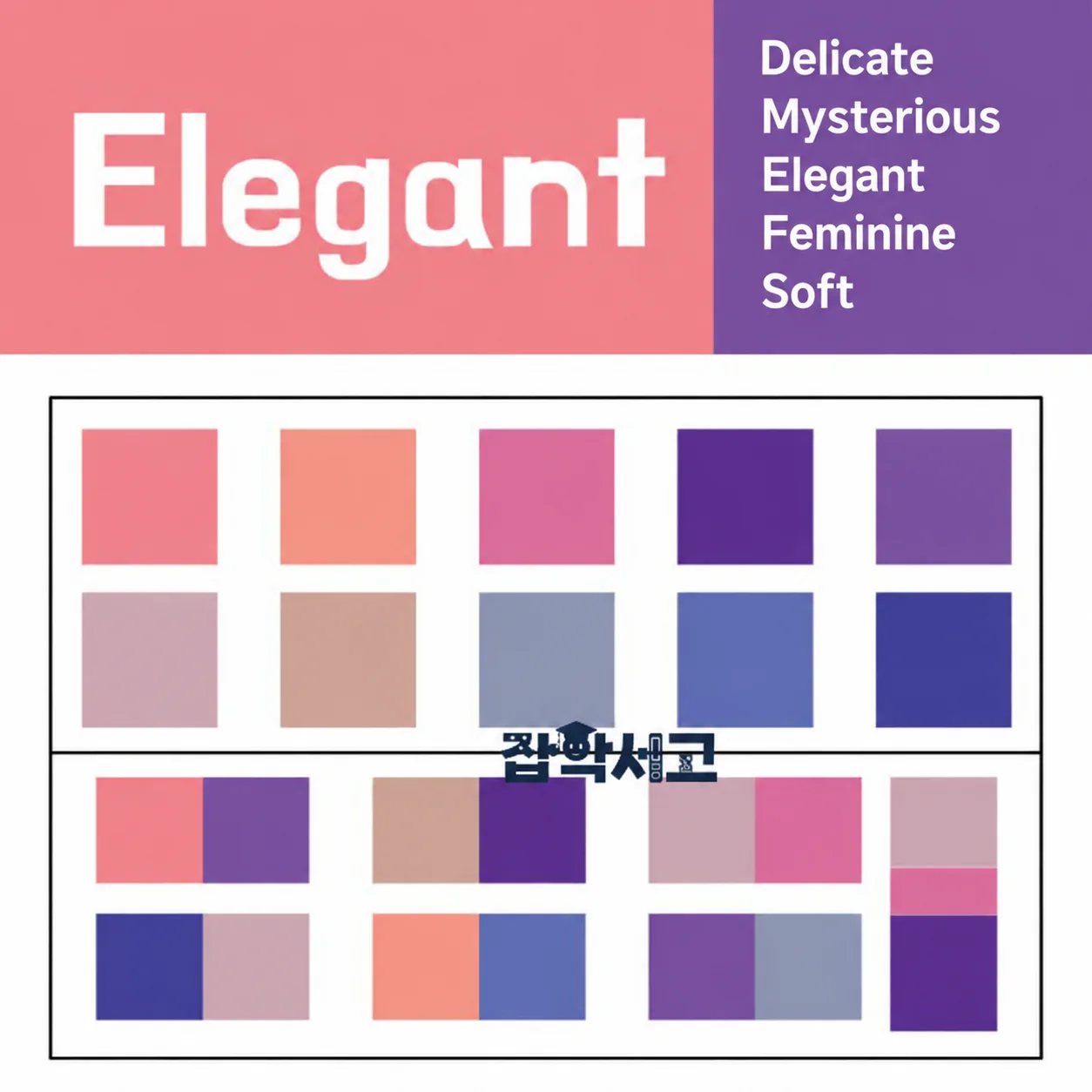 Elegant color scheme
Source: GK Library palette examples. Impressions vary by context.
★ Colors to use
- Soft grays, pinks, and purples
- Strong contrast (intense beauty)
- Contrast between pale colors (refinement, weighty dignity)
- Pale colors with gradation (serenity, sophisticated grace)
★ Tips for combining colors
* Gradation schemes expressed through hue
- Used to avoid the monotony of a single color. They feel dual, progressive, and colorful. However, readability and legibility drop, and they can easily look cluttered.
* Gradation schemes expressed through value and saturation
- Add white or black to a pure hue. Changes in value and saturation give a stable, harmonious feeling. This scheme feels slightly muted.
* Multicolor gradation schemes
- These can give visual splendor and a fantastical image. They can emphasize colors and create a sense of space. They look futuristic and mysterious, but the scheme needs to fit the concept.
※ Modern (sophisticated, contemporary, urban, progressive, metropolitan, cutting-edge, distinctive)
 Sophisticated color scheme
Source: GK Library palette examples. Impressions vary by context.
★ Colors to use
- Achromatic black, gray, and white
- Cool blue colors (simple, sophisticated)
- Bold contrast in value and hue (futuristic)
- Warm color schemes (casual, dynamic sophistication, emphasis)
★ Tips for combining colors
* Black schemes in gray tones
- These have a weighty, stable mood. They don’t get tiresome, feel calm and dignified, and suit a luxurious, sophisticated atmosphere.
* White schemes in gray tones
- These are highly legible and eye-catching while giving a stable, trustworthy image. This is the most modern and sophisticated scheme and is well suited to creating a trustworthy atmosphere.
* Multicolor schemes in gray tones
- These carry a sense of stability and balance. Because gray harmonizes with any color, low-saturation gray is used as a background.
* Schemes applied with a single (warm) color
- These are visually exciting and convey a strongly dynamic mood. They are highly readable and legible. They give an energetic image and create a simple yet strong effect.
* Schemes applied with a single (cool) color
- These are clean, calm colors. They give a still, intellectual image. Combined with white, they become more readable and can give a modern, clean image.
* Achromatic accent colors
- Colors are distinguished by differences in value. Using a white accent in a low-value or low-saturation scheme gives high readability and legibility. They harmonize in combination with any color.
※ Ethnic (folk, indigenous, exotic, unique, traditional)
 Folk color scheme
Source: GK Library palette examples. Impressions vary by context.
★ Colors to use
- Dark, highly saturated colors
- Mainly low value
- Bright colors as accents
★ Colors to avoid
- Value and saturation that are too low create a stagnant, dated mood
★ Tips for combining colors
* Accent colors on a dark scheme
- Combine colors using saturation contrast; the greater the difference in saturation, the more vivid the result. A high-saturation accent color on a low-saturation background can draw strong visual attention and give clear legibility.
Where each color combination sits
In addition, the following roughly shows where the colors for each feeling described above are located on the color wheel.
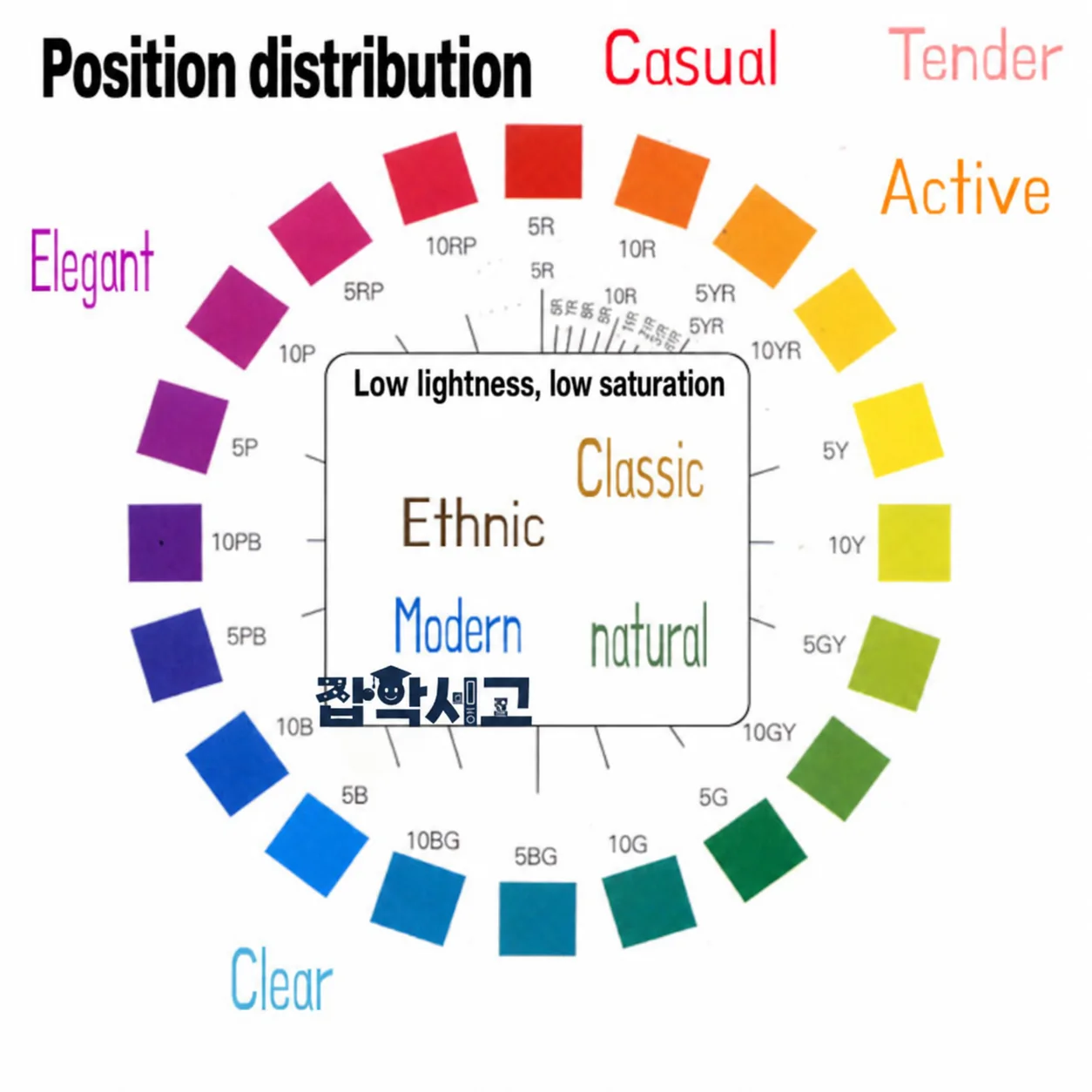 Where each color scheme sits
On the color wheel above, the high-value, high-saturation families that should give a bright feeling are marked on the outside of the wheel, and the low-value, low-saturation families that should give a dark feeling are marked toward the inside. However, opposing colors are also frequently used together, as in complementary contrast, so please use the color wheel above only as a reference for rough positions.
That concludes this material on color schemes organized by feeling. Program tools outside the design field usually offer only monotonous colors like the rainbow palette, so most people are used to them. But if you look closely, you can see that there are a great many colors depending on how saturation and value are adjusted, and that there are many ways to combine them. The color schemes summarized in this article are only a tiny fraction; when combining colors, there must be countless possibilities that reflect the feeling suited to each situation.
So I hope you will use the color schemes introduced in this article as a basis for basic practice, and then build the skill to create more varied and attractive color schemes using your own sense.