When you are walking down the street and see red lettering against a yellow background, a particular fast-food brand naturally comes to mind. When you see wording in a plain, restrained typeface on a clean white background, you may also think of an IT company or lifestyle brand that values simplicity.
This combination of visual elements and the language used to communicate creates an atmosphere unique to a particular brand. In design and marketing, this is called “Tone & Manner.”
As internet and mobile environments have developed, the amount of information and design that consumers encounter each day has grown explosively. The secret behind brands that remain in the public's memory amid countless visual media, build trust, and ultimately create a fan base lies in clear, consistent tone and manner.
In this article, we will systematically explore tone and manner, a core concept in design studies, from its definition and components to concrete examples and practical strategies for applying it to design and branding.
The Concept and Core Components of Tone and Manner
What Is Tone & Manner?
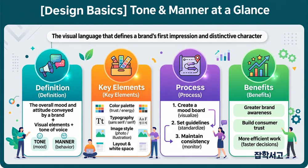
As its name suggests, tone and manner is a concept that combines “Tone” (tone of voice, hue) and “Manner” (attitude, approach).
- Tone: The atmosphere, color qualities, tone of voice, and emotional feel that emerge when conveying a message. (Examples: brightness, darkness, calmness, liveliness, a professional feel, and so on)
- Manner: The way design elements are arranged and expressed, their structure, rules, and design identity. (Examples: use of white space, layout patterns, attitude in communication, and so on)
Ultimately, tone and manner is an integrated guideline and a visual/nonvisual identity that answers the question, “With what atmosphere (Tone), and while maintaining what attitude and approach (Manner), will we convey our message?”
The 4 Main Visual Elements That Make Up Tone and Manner

The most essential elements for giving concrete form to tone and manner in design fall into four broad categories.
(1) Color (Color Palette)
Color is the visual element that affects human emotions most quickly and powerfully.
- Define the Primary Color, Secondary Color, and Accent Color in advance to establish the brand's overall sense of warmth or coolness.
- Example: Financial and legal services use shades of blue (Navy) as their primary color to convey trust, while eco-friendly and health brands adopt green (Green) as their central color.
(2) Typography
The shape and weight of typefaces, letter spacing, and line spacing visualize the brand's voice.
- Serif typefaces convey a classic, trustworthy, traditional feel.
- Sans-serif typefaces give a modern, clean, highly legible impression.
- Script or handwritten styles create friendliness and an emotional atmosphere.
(3) Graphics and Image Style (Graphic & Image Style)
The feel of the photographs, illustrations, and icons used must be consistent.
- Will you mainly use photographs of real people, or will you use Flat illustrations?
- Will you lower the saturation of photographs to create a weighty feel, or increase it to create a sense of vitality?
(4) Layout & White Space
The user experience changes depending on how elements are arranged on the screen.
- Using generous white space creates an upscale, relaxed feel.
- A layout with high information density creates a dynamic, practical feel that presents a great deal of information at a glance.
Understanding Tone and Manner Through Simple Examples
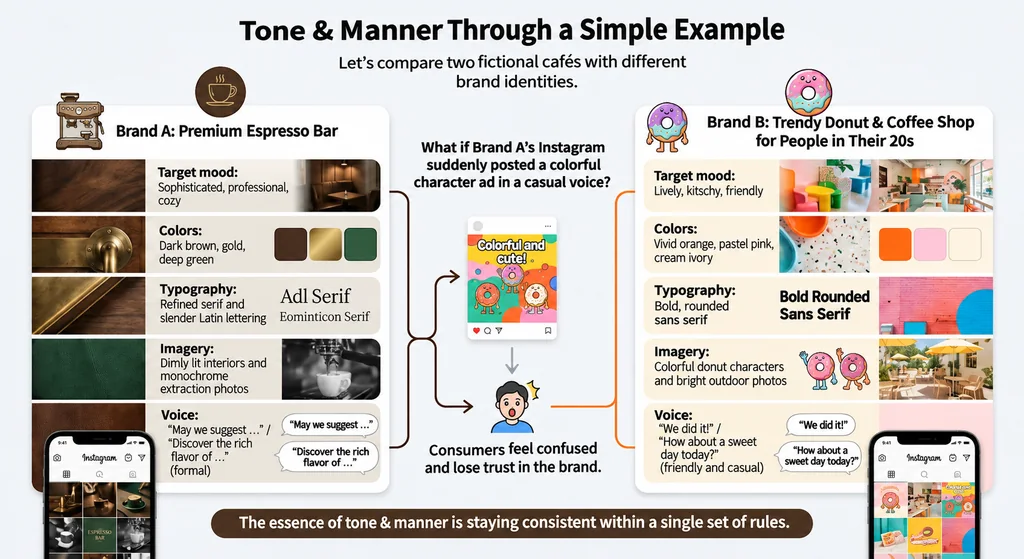
To help with understanding, let us compare two hypothetical café brands.
Brand A: A Premium Espresso Bar
- Desired atmosphere: Old-world charm, professionalism, coziness
- Colors: Dark brown, gold, deep green
- Typography: Refined Serif typefaces and thin English-language fonts
- Images: Dimly lit interiors and black-and-white photographs of coffee being brewed
- Text tone: “We suggest ~,” “Experience the deep flavors of ~” (formal language)
Brand B: A Trendy Donut & Coffee Shop Targeting People in Their 20s
- Desired atmosphere: Liveliness, kitsch, friendliness
- Colors: Vivid orange, pastel pink, creamy ivory
- Typography: Bold, rounded sans-serif typefaces
- Images: Colorful donut character illustrations and bright outdoor photographs
- Text tone: “Did ~!”, “How about a sweet day today?” (friendly informal speech / conversational polite speech)
What would happen if colorful characters and promotional posts in an informal tone suddenly appeared on Brand A's café Instagram account? Consumers would feel that something was out of place and lose trust in the brand. Maintaining consistency under a single set of rules in this way is the core of tone and manner.
A Practical Process for Establishing Successful Tone and Manner

When starting a design project or branding work, follow the 3-step process below to establish clear tone and manner.
Create a Mood Board
If you define the atmosphere only in words, each team member may picture something different. Gather photographs, color palettes, textures, and font samples that match the desired atmosphere on a single board to create a visual reference point.
Establish Design Guidelines (Design System)
Document and standardize the HEX codes of the colors to be used, typeface choices and sizing systems, icon styles, button designs, and so on.
Ongoing Monitoring and Maintenance
Review whether the guidelines are applied consistently across all media, including posters, websites, SNS content, and packaging.
The Competitive Edge That Tone and Manner Gives Designers and Brands
Tone and manner is not simply a “skill for making things look pretty.” It is a visual language and a strategic promise that enables the public to intuitively sense the Core Value a brand seeks to convey.
Well-established tone and manner brings the following powerful benefits.
- Strong imagination and brand awareness: The public immediately thinks of a particular brand just by seeing its visual elements.
- Building trust: A brand that maintains a consistent attitude gives consumers a sense of professionalism and stability.
- Increased work efficiency: When design guidelines are established, the time needed to make decisions when creating new content is dramatically reduced.
When learning design or working on real projects, if you develop the habit of looking beyond the simple arrangement of elements and first asking, “What overall tone and manner is this work intended to convey?”, you will be able to produce results with greater depth and persuasiveness.