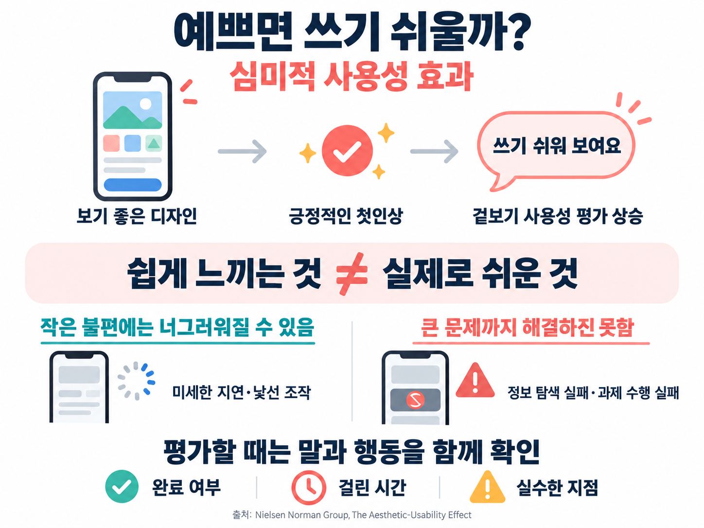
Imagine two apps with the same features. One has neat colors and text and generous white space; the other has buttons packed tight and colors that clash. Even before anyone has tapped a button, many people feel that the first app will be easier to use. That tendency to treat a good-looking design as easier to use is the aesthetic-usability effect.
In plain terms, the aesthetic-usability effect means that people tend to believe a beautiful product works better and is easier to use, even when it is not actually more efficient. It was first reported in 1995 by Masaaki Kurosu and Kaori Kashimura of Hitachi’s Design Center, in an experiment with automated teller machine (ATM) screens.
In this piece we will look in turn at the experiment that first identified the effect, research that tested it across cultures and after real use, why beauty can make people more forgiving, and the limits you need to know before relying on it in design.
How Beauty Changes Perceived Ease of Use
What Is the Aesthetic-Usability Effect?
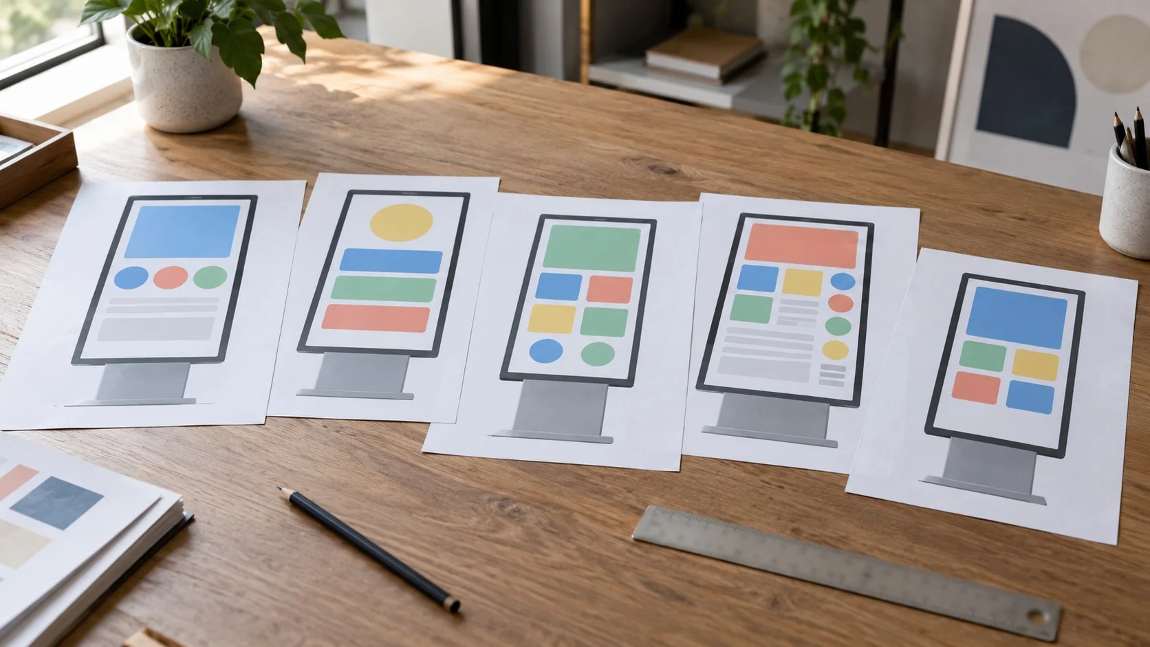
Kurosu and Kashimura first had 26 people, including designers and engineers, arrange the buttons and display areas of an ATM screen as they thought best. They then showed the 26 layouts to 252 people and asked them to rate, on a 10-point scale, how easy each layout looked to use and how beautiful it looked. The two researchers split usability into two kinds.
- Apparent Usability: how easy something seems to use when you only look at the screen, before you try it.
- Inherent Usability: design features that affect real efficiency of use, such as the order of operations or how buttons are grouped.
Analysis showed that apparent usability correlated fairly strongly with beauty scores (about 0.589), while links to the factors that make up inherent usability were mostly weak. Even when people try to judge function, they are heavily swayed by appearance.
The Power of Beauty Confirmed in Experiments

Some wondered whether the result was specific to Japanese culture. In 1997, Noam Tractinsky of Ben-Gurion University in Israel showed the same 26 layouts to 104 Israeli engineering students, and the correlation between beauty and apparent usability came out even higher, about 0.921.
(1) An impression that remains after use
In a 2000 paper titled “What is Beautiful is Usable,” Tractinsky and colleagues had 132 people actually use a computer-simulated ATM. After finishing 11 tasks, participants rated the interface again; post-use ratings tracked the beauty of the screen more than its real usability.
(2) A judgment that resembles how we see people
The researchers saw this as similar to the 1972 social-psychology finding “What is Beautiful is Good.” Just as people tend to assume that an attractive person also has a good personality, a single positive impression can lift other judgments—a halo effect that shows up for products as well.
Why Beauty Makes People More Forgiving

Cognitive scientist Donald Norman explained the phenomenon through emotion in his 2004 book Emotional Design. He divided how people take in a product into three levels.
- Visceral Level: the first impression and attraction that arise the moment you see and touch something.
- Behavioral Level: the convenience and feel of use you notice while actually operating it.
- Reflective Level: thoughts about what the product means to you and how it will look to others.
According to Norman, when a good feeling arises at the visceral level, people relax and, even when they hit a small inconvenience, look for another way through. So a beautiful product tends to make users less likely to dwell on small flaws and more willing to put up with them for longer. That forgiveness can also keep first-time users from leaving while they learn unfamiliar features.
Limits to Know Before Relying on Beauty

Treating the effect as a cure-all for design is a mistake. The user-experience research firm Nielsen Norman Group points out limits like these.
(1) It only covers small problems
A good-looking screen can help people shrug off minor friction, but it will not hide a large failure such as never finding the information they need. Even a dramatic background photo that dazzles at first becomes a source of irritation if it makes information hard to find.
(2) It can blur usability tests
Participants sometimes give high scores after struggling with a task, saying things like “the colors felt comfortable.” So when testing, look at actual behavior and failure points together with what users say.
(3) Decoration that outrun function backfire
If text is so pale it is hard to read, or flashy motion makes buttons hard to find, beauty becomes a burden. Good design is not adding decoration; it is using orderly layout and clear contrast to make usefulness stand out.
The aesthetic-usability effect shows that beauty is not mere ornament: it is a force that helps users trust a product and try it. But that force is strongest when function backs it up, and appearance cannot hide a serious flaw.
Refining appearance and usefulness together is the first step toward a design that users trust and keep using.