
When six dots are arranged in twos, we do not see six dots; we see three pairs. A circle drawn with a broken line is read as a circle without a moment’s hesitation. The eye grasps the shape of the whole before the individual pieces, and the rules that describe this kind of perception are known as the Gestalt Principles of Perception.
Put simply, the Gestalt principles describe the tendency of people not to see scattered visual elements one by one, but to group them into a single unit based on cues such as nearness, likeness and continuity. Gestalt is a German word meaning “form” or “configuration,” and these principles have become the basic grammar of design for organizing screens and pages today.
In this piece we will look in turn at how the Gestalt principles came about and the main principles, examples of how they are used in logos and on screens, and finally what designers should watch out for.
The Order the Eye Brings to a Screen First
What Are the Gestalt Principles?

Gestalt psychology was founded in Germany in the early 20th century by Max Wertheimer, Kurt Koffka and Wolfgang Köhler. Its starting point was an experiment Wertheimer published in 1912. People watching two beams of light switch on alternately felt as though the light was moving from one side to the other, even though nothing was actually moving. He called this the Phi Phenomenon.
At the time, mainstream psychology tried to analyze experience by breaking it down into the smallest units of sensation. The Gestalt psychologists argued the opposite: the whole is perceived first, and the meaning of each part is determined within the whole. Koffka put it this way: “The whole is something other than the sum of its parts.”
In 1923, Wertheimer set out in a paper the laws by which people group perceptual elements, and this became the root of today’s Gestalt principles. Underlying all of the principles is the Law of Prägnanz: people tend to perceive what they see in the simplest, most regular and most orderly form possible.
Five Key Gestalt Principles

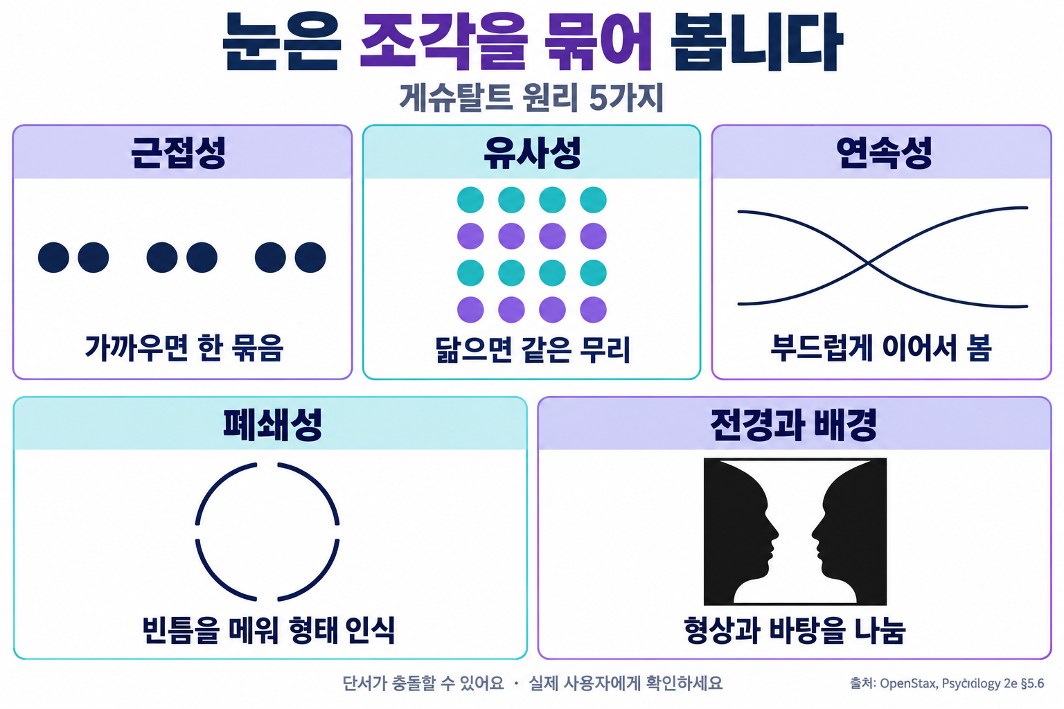
The Gestalt principles are organized in many ways, but the five used most often in design are the following.
(1) Proximity
Elements placed close together are seen as a group even if their shapes differ. Simply adjusting the spacing can show which things belong together.
(2) Similarity
Elements that share a color, shape or size are read as part of the same group. We assume that buttons of the same color perform the same kind of function.
(3) Continuity
People tend to follow a smoothly continuing line rather than a path that bends abruptly. Even when two lines cross, we see each one as a single unbroken line.
(4) Closure
Even when part of an outline is missing, the mind fills in the gap and recognizes a complete shape.
(5) Figure-Ground
The eye divides a scene into a figure that stands out in front and the ground that lies behind it. Around 1915, the Danish psychologist Edgar Rubin demonstrated this principle with the “Rubin Vase,” which can be seen either as two faces in profile or as a white vase.
Understanding the Gestalt Principles Through Easy Examples

The Gestalt principles are hidden throughout the logos and screens we see every day.
[Case] The Arrow Hidden Between the Letters: The FedEx Logo
The FedEx logo, created in 1994 by Lindon Leader of Landor Associates, contains a right-pointing arrow in the empty space between the capital E and the x. At first you see only the letters, but once you notice the arrow, you can never stop seeing it. It is a clever use of the figure-ground principle, turning empty background space into a figure.
- Form Layout: placing each field label directly above its input box and leaving generous space between fields means that, thanks to proximity, no one is confused about which label belongs to which box.
- Navigation Menu: menu items given the same shape and color are read as one set, in line with similarity.
- Horizontal Scroll List: deliberately showing the card at the right edge cut off halfway leads people, through continuity and closure, to assume more cards follow, so they try swiping the screen.
Things to Watch Out for When Using the Gestalt Principles

The Gestalt principles are powerful, but they are not a universal formula. Concepts such as Prägnanz are hard to define precisely, and the principles have been criticized for merely describing phenomena without explaining the mechanisms in the brain. Research therefore continued, with later scholars such as the American psychologist Stephen Palmer adding principles like Common Region, under which elements enclosed by a line or box are seen as a group.
- Principle Conflict: when two principles disagree, as with elements that are close together but different in color, users hesitate over how to group them. Make all the cues for a single group point in the same direction.
- Excessive Omission: relying on closure and erasing too much of an outline can make a shape unrecognizable. Be especially careful on small screens.
- User Testing: whether a grouping that looks natural to the designer looks the same to users can only be confirmed by actually showing it to them.
The Gestalt principles are rules of perception stating that the human eye groups scattered elements by nearness, likeness, continuity, closure, and figure and ground, and reads them as a whole. This idea, born in a psychology laboratory more than a century ago, has become the foundation for the order of today’s logos, web screens, maps and signs.
Before decorating each element one by one, first consider how the eye will group them together: that is the first step toward design that is easy to read.