
Have you ever stood in front of a door, unsure whether to pull or push the handle? A well-designed handle shows your hand the way—‘hold it like this’—without saying a word. In design studies, this property of an object suggesting the actions a user can take is called ‘affordance.’
Put simply, affordance means ‘the relationship in which an object’s physical and perceptual characteristics make certain actions possible for, or encourage them in, a user.’ It is exactly the feeling of your finger naturally reaching for a button that sticks out slightly, even though nothing on it says ‘press.’
This article explains, in an easy-to-understand way and from the perspective of design studies, everything from the origins of affordance and the concept of perceived affordance to its relationship with signifiers and constraints, examples from everyday life and the digital world, and design points to check in practice.
Affordance: Concept and Design
What Is Affordance?
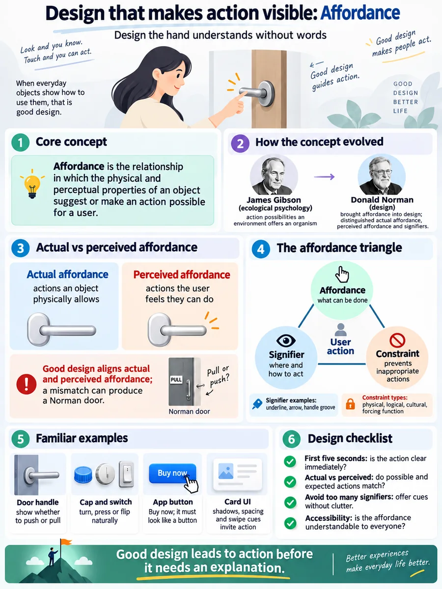

The term affordance was proposed by the ecological psychologist James J. Gibson in the 1970s. For him, an affordance was ‘the possibility for action that the environment offers an organism’ itself. Flat ground affords walking and sitting, and a handle-sized protrusion affords grasping. These relationships already exist in the physical world, regardless of any advertising copy.
The person who spread the term widely in the design field was Donald A. Norman. In “The Design of Everyday Things”, he stressed that what designers can actually work with is not only the ‘real possibilities’ but also ‘how users notice’ those possibilities. That is why Norman later distinguished between ‘perceived affordance’ and the ‘signifier,’ in an effort to reduce misunderstanding.
- Real affordance: The actions an object physically allows. A button on a screen cannot actually be ‘pressed’; it can only be tapped or clicked.
- Perceived affordance: The actions a user sees and feels ‘seem possible.’ Shadows, a sense of depth, and changes in the cursor create it.
Good design aligns real possibilities with perceived ones. If you put only a pull handle on a door that must be pushed open, the real and the perceived clash, and it becomes a famous failure like the ‘Norman door.’
Signifiers and Constraints: Two Axes That Reveal Affordance
Affordance alone does not make every action visible. Norman called the cues that help users find the right action ‘signifiers,’ and described the devices that block or narrow wrong actions as ‘constraints.’
(1) Signifiers
These are markers that point and say ‘here, like this,’ such as underlined blue text, a ‘Next’ arrow, or the curve of a groove in a handle. A signifier is not an affordance itself, but it is a signal that strengthens perceived affordance.
(2) Physical constraints
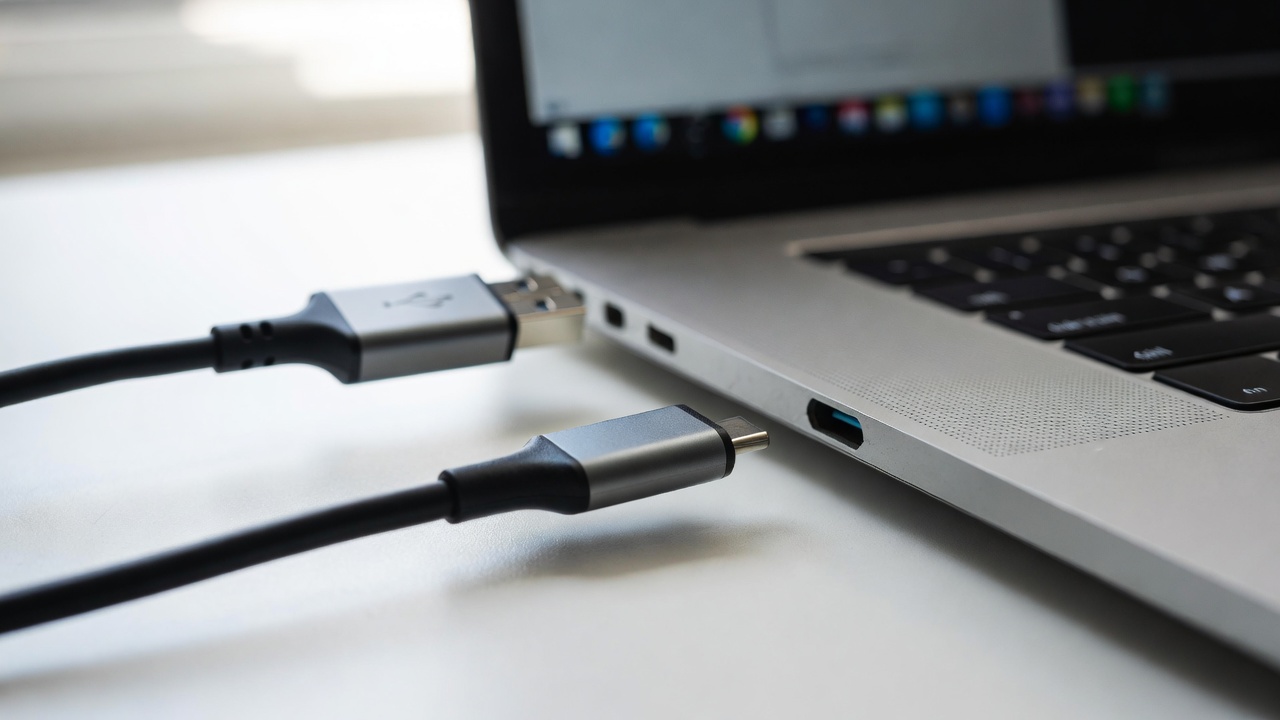
Like a USB-A plug that fits only one way, these physically limit the range that the body or a tool allows. It is a design that won’t go in unless it is in the right orientation.
(3) Logical and cultural constraints
Reading-direction conventions such as left meaning ‘previous’ and right meaning ‘next,’ and cultural agreements such as red meaning danger or stop, fall into this category. If you ignore culture, a signifier can backfire.
(4) Forcing functions
Like the sequence at an ATM that requires you to take out your card before you can receive cash, these are strong constraints that make it impossible to skip a required action. They are often used for safety and error prevention.
Affordances, signifiers, and constraints are not substitutes for one another. Design reviews become easier if you understand them as a triangular structure: affordance lays down ‘what can be done,’ signifiers shine a light on ‘where and how,’ and constraints block ‘the paths you shouldn’t take.’
Understanding Affordance Through Simple Examples

An abstract concept becomes clear the moment you can touch it with your hands. Here are cases we often encounter in daily life and on screens, divided into three groups.
[Case 1] Doors and handles
A door with only a flat metal plate strongly suggests ‘push,’ while a loop-shaped handle suggests ‘pull.’ The problem arises when a loop handle is attached to a door that must be pushed. When perceived affordance conflicts with the actual operation, users hesitate every time.
[Case 2] Bottle caps and switches
A cap with visible threads shows ‘twist,’ and the protrusion of a large toggle switch shows ‘flip.’ Conversely, a light switch that is just a smooth touch panel can actually be tapped, but for first-time users its affordance is weak, so it ends up relying on a sticker as a signifier.
[Case 3] App buttons and card UIs
A shadow that makes something look slightly raised, a press animation, and the color contrast between active and inactive states are perceived affordances on a digital screen. When a card-style list appears slightly cut off at the left or right edge, it suggests ‘you can swipe,’ whereas when it is cut off exactly at the edge, the possibility of scrolling is hard to see.
What these cases have in common is that it is ‘form and feedback,’ not a manual, that teaches the action. Affordance does its job when users can guess the next action without trial and error.
How to Check Affordance in Practice

If you narrow affordance down to just ‘pretty 3D buttons,’ your design becomes thin. When building UIs for products, services, or content, it helps to make the following checks a habit.
(1) Run a first-five-seconds test
Show a screen or prototype without any explanation and ask only, “What do you think you can do right now?” If the answers don’t match the expected actions, perceived affordance or signifiers are lacking.
(2) Write the real and the perceived side by side
Write ‘possible actions’ and ‘actions the user guesses’ in two columns and compare them. If you see gaps or conflicts, reinforce signifiers in the form of shape, motion, or wording.
(3) Don’t rely on signifiers alone
A UI that holds up only with wording like “Click here” is a sign of too many signifiers and too little affordance. Make actions visible through shape, position, and feedback first, and keep wording as a supplement.
(4) Look at accessibility as well
Buttons distinguished only by color, or controls that allow only gestures requiring large hand movements, close off affordance for some users. Inclusive affordance means making the same action possible across size, contrast, keyboard, and screen-reader paths.
However, exaggerated depth and excessive animation can become visual noise that hides the actions that actually matter. Affordance did not disappear after flat design; it simply moved to more restrained signals such as shadows, white space, motion, and state changes. The standard is not the trendy style but ‘whether users can guess the next action.’
Design that the hand understands before any words are spoken. Revealing possible actions through form and feedback, and choosing to reduce mistaken guesses—that is the first step of affordance.