Web design extends beyond visual elements; its core lies in balancing user experience (UX) and functionality to effectively achieve a website's purpose. Effective web design requires establishing clear practical strategies and analyzing the latest trends to build a website that is more user-friendly and aligned with its purpose.
This material examines in depth strategic approaches to web design, methods for optimizing design elements to improve UX, and the tools and technologies needed to build successful websites.
An Overview of Practical Strategies for Efficient Web Design
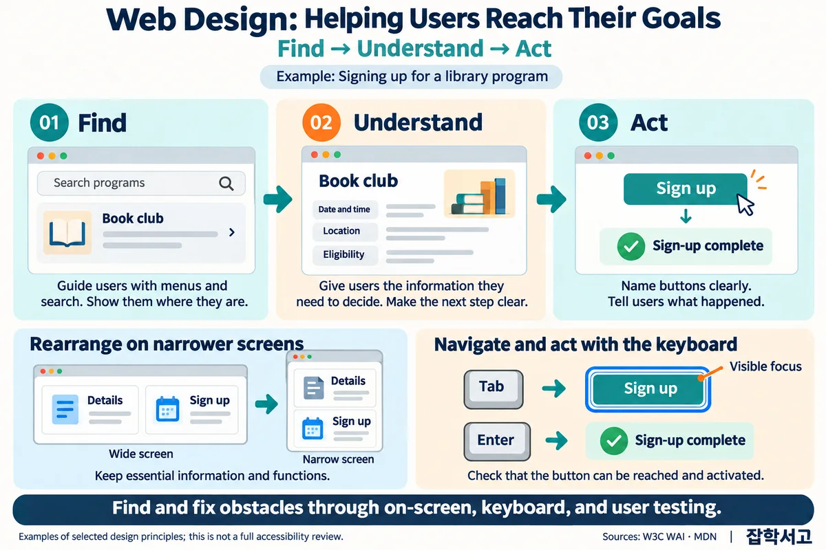
Defining the Purpose and Goals of Web Design
The first step in efficient web design is setting clear goals. Only by clearly understanding a website's primary purpose and using it to determine the design direction can the needs of both users and the business be met. Goals greatly influence the website's structure, content placement, and user flows, and each element must align with the overall goals. This enables the site to communicate a clear message to visitors and establish a foundation for maximizing business results.
User-Centered Design
User-centered design is a core element of web design. It must reflect users' expectations and behavior so they can easily navigate the site and find the information they want. To achieve this, regular user testing and feedback collection are essential for identifying and addressing design problems. Ongoing interaction with users can increase user satisfaction, which directly contributes to the successful operation of a website.
The Need for Responsive Web Design
Responsive web design is essential today, given that users access websites from a variety of devices. Responsive design means that a website automatically adjusts to different screen sizes, including mobile phones, tablets, and desktop computers. This allows users to have a consistent experience regardless of the device they use. Responsive design is becoming increasingly important, particularly as the number of mobile users grows rapidly, and it can be implemented easily using CSS media queries.
Consistent Visual Design
Consistency in visual design is an important factor in helping users easily remember and recognize a website. When visual elements such as the color palette, typography, and icon styles are arranged consistently, users can navigate the site more easily and develop a sense of trust in the brand. This positively affects the strength of the brand image and is an important part of improving the user experience.
The Importance of Web Accessibility
Web accessibility aims to design websites so that all users can use them without discrimination. Design that takes users with disabilities into consideration is particularly important. Following WCAG (Web Content Accessibility Guidelines) is a way to ensure standard accessibility and can also be viewed as part of social responsibility. Improving web accessibility can attract a broader user base, which contributes greatly to a website's success.
SEO Strategies and Web Design
SEO (Search Engine Optimization) strategies are indispensable to efficient web design. Search engine optimization is a key strategy for increasing a website's visibility and bringing more users to it. This requires appropriate use of keywords and optimization of meta tags and image alternative text. Design that takes search engine algorithms into account raises the site's ranking and drives more traffic.
How to Analyze and Apply Web Design Trends

The Importance of Changing Web Design Trends
Web design is evolving in a constantly changing environment, and appropriately reflecting these trends is key to building a successful website. As users' expectations and needs change, incorporating new design elements is essential to maintaining a website's competitiveness. By identifying the latest trends and implementing them appropriately, a website can maintain a user-friendly and modern feel.
The Spread of Dark Mode and Its Effective Implementation
Dark mode is among the most popular recent trends in web design. Dark mode is a design approach that uses light text on a dark background, offering the benefits of reduced eye strain and battery consumption. Many users prefer dark mode because it can minimize eye strain during nighttime use. To apply this design effectively, sufficient contrast must be maintained, and color combinations that improve readability must be selected carefully. When implementing dark mode, contrast must be well balanced so that interface elements such as text and buttons are clearly visible to users, and providing a consistent experience on mobile devices is also important.
Using 3D Graphics and Animation
Using 3D graphics and animation is highly effective at making a website more immersive and leaving users with a strong visual impression. Technologies such as WebGL and Three.js can be used to implement 3D elements, which are used extensively in fields where visual expression is important, particularly games, art, and product showcases. 3D graphics go beyond simple visual decoration to serve as a powerful tool that helps users understand products more deeply and encourages them to stay on a website longer. However, because these elements can affect page loading speed and performance, optimized code and appropriate use of technology are required.
The Importance of Microinteractions
Microinteractions are an important element that strengthens interaction with users through small animations. Small movements that occur when buttons are clicked, pages load, or users scroll provide intuitive feedback and make the website more lively. For example, a color change or icon movement that occurs when a button is clicked clearly indicates the action the user is currently performing. Microinteractions attract users' attention and contribute greatly to improving a website's overall user experience.
The Neon Color Trend and Appropriate Use
Over the past few years, neon colors have become an established trend emphasizing a bold and modern visual style. Intense neon colors are often used on websites and by brands targeting younger audiences, and they are effective at attracting attention and creating memorable designs. However, excessive use of neon colors can cause eye strain, so they should be used in appropriate proportions. This makes it possible to convey a fresh and energetic image while minimizing visual fatigue.
Introducing Progressive Web Apps (PWA)
Progressive web apps (PWA) are a trend that uses the latest web technologies to provide an app-like user experience on websites. PWAs are characterized by faster loading speeds, accessibility even when offline, and an improved user experience. This approach relies on technologies such as service workers and web app manifests to improve convenience for mobile users. PWAs allow websites to be used like apps without an installation process, providing mobile users with a smoother and more intuitive experience.
Combining Personalized User Experiences with AI Technology
Personalized user experience is an important trend in which websites provide tailored content and services based on users' preferences and behavior. Machine learning and AI technologies can be used to analyze user patterns and implement individualized content, recommendation systems, and similar features based on those patterns. Examples include providing personalized recommendations based on products a user has previously viewed or prioritizing content from categories the user frequently visits. These personalized experiences help increase user satisfaction and the rate of return visits to a website.
Optimizing Design Elements to Improve User Experience

The Importance of Optimizing Loading Speed
Loading speed is among the most important factors in user experience. If a website takes a long time to load, users are likely to leave quickly. To prevent this, image file sizes should be reduced, unnecessary scripts or plugins that the website does not use should be removed, and optimization methods such as browser caching should be applied. Using a content delivery network (CDN) can also deliver data quickly from geographically distant servers, further improving loading speed. Because site speed also affects search engine optimization (SEO), fast loading is important both for users and for visibility in search engines.
Designing Intuitive and Efficient Navigation
Effective navigation helps users reach their destinations easily without getting lost on a website. Users prefer an intuitive and concise menu structure and need clear categories and fast search functionality. Menus should use terms that users can easily understand, and deeply nested menu hierarchies should be avoided because they can confuse users. The visual design of navigation is also important. Clearly defined button sizes and placement help users click more easily and require particular attention in mobile environments. Providing a breadcrumb feature that shows users where they are while browsing is also a good strategy for helping them understand their location.
Hierarchical Information Structure and Readability
Structuring information hierarchically helps users understand content more easily and find the information they want quickly. To achieve this, it is important to clearly distinguish hierarchical levels such as headings, subheadings, and body text. Visual priorities should be established so that important information stands out, while supplementary information is arranged with less visual emphasis. Readability improves when elements such as font size, color, and spacing are used appropriately to create a visual hierarchy. For example, it is effective to emphasize key messages or important information in larger, bold text and place supplementary explanations in smaller text. When information is clearly distinguished in this way, users have a better experience on the website.
The Need for Mobile Optimization
As the number of mobile users continues to grow, optimizing websites for mobile environments is essential rather than optional. Responsive web design allows websites to provide a consistent experience across different screen sizes, with layouts automatically adjusting to users' devices. Mobile optimization requires appropriately adjusting button sizes and spacing for touch-based interfaces, and it is important to keep screens simple by removing unnecessary elements. Image sizes should also be reduced and JavaScript and CSS files optimized to save data and enable fast loading on mobile devices. Mobile optimization positively affects both user satisfaction and search engine rankings.
Using and Optimizing Visual Content
Visual content such as images, videos, and infographics is an important element that attracts users' attention and encourages them to stay on a website longer. Such content can effectively communicate information that is difficult to convey through text alone and plays a major role in helping users understand it. However, the large file sizes of visual content can negatively affect page loading speed. To prevent this, image formats should be optimized and videos should use streaming to reduce loading times. Providing alternative text (alt text) for images can also contribute to search engine optimization. Visual content enriches the user experience, but it must be managed carefully because neglecting optimization can instead have a negative effect.
User Feedback and Continuous Improvement
A website is an organic entity that requires continuous improvement based on user feedback, rather than something that is finished once it has been completed. User surveys, heatmap analysis, and tools for analyzing user behavior patterns can identify a website's strengths and weaknesses and reveal areas for improvement. User feedback is among the most reliable ways to identify website problems and can help a website evolve to meet users' needs. User satisfaction can be continually increased by resolving problems discovered through feedback and regularly updating the website to reflect new trends and technologies.
An Introduction to Tools and Technologies for Successful Web Design

Choosing Appropriate Tools and Technologies
Success in web design begins with choosing appropriate tools and technologies. Each tool has its own strengths, and using them can make the design process more efficient and effective. Choosing the right tools and technologies can determine the overall quality of a project.
Adobe XD: A Powerful UX/UI Design Tool
Adobe XD is a tool optimized for UX/UI design, offering powerful features that make it easy to create wireframes, prototypes, and interaction designs. It is compatible with various Adobe tools and also includes features that efficiently support collaboration between design teams. This allows interfaces for use across a range of devices to be designed quickly and feedback to be received in real time. Its prototyping features are particularly useful because they create clickable mockups that can simulate the actual user experience in advance, making it possible to identify and correct potential problems during the design process.
Sketch: A Design Tool Optimized for Mac Users
Sketch is a design tool for Mac users that offers simple yet high-performance features. Because it is vector-based, high-quality results can be obtained easily for displays of various resolutions. It also offers excellent plugin compatibility, making it possible to manage design workflows efficiently. Sketch is particularly easy to learn thanks to its simple and intuitive interface, and it is especially advantageous when building design systems using multiple pages and symbols. This helps maintain consistent design even in complex web projects.
Figma: A Cloud-Based Design Collaboration Tool
Figma is a cloud-based collaboration tool that allows multiple team members to work simultaneously in real time. It can be accessed directly through a browser, offering the major advantage of working anytime and anywhere, regardless of platform. Team members can provide feedback and make revisions in real time, and version control makes it easy to track changes. It is particularly useful in remote work environments, improving team collaboration efficiency by preventing version conflicts in design files and allowing different ideas to be incorporated immediately.
HTML5 and CSS3: Foundational Technologies for Web Design
HTML5 and CSS3 are foundational technologies that define the structure and styling of web pages. HTML5 supports the integration of various multimedia elements and complex interactions and serves as the foundation for organizing website content. CSS3 visually presents the corresponding design elements and provides various features that make it easy to create responsive layouts. In particular, using the latest CSS Grid and Flexbox features makes it easy to implement complex layouts, further improving the user experience.
JavaScript Frameworks: Efficient Development of Dynamic Web Applications
JavaScript frameworks such as React, Angular, and Vue.js are essential tools for developing dynamic web applications. These frameworks support component-based development, greatly improving code reusability and maintainability. React is particularly powerful for building single-page applications (SPA), while Angular provides a structure and powerful tools suitable for large-scale applications. Vue.js is a relatively lightweight and easy-to-learn framework that can be used flexibly in a variety of projects. All of these frameworks have active community support, making it easy to find and use helpful resources during development.
Git: An Efficient Version Control System
Using a version control system such as Git is essential in web development. Git manages the history of code changes and minimizes conflicts that may arise when multiple developers work simultaneously. Platforms such as GitHub and GitLab enable smooth collaboration with team members, while working on separate branches and then merging them helps maintain project consistency. Git also provides useful features for dealing with errors caused by mistakes or when returning to a previous version is necessary, improving project stability and quality.
In conclusion, choosing appropriate tools and technologies is essential for successful web design. Design tools such as Adobe XD, Sketch, and Figma enable UX/UI work to proceed quickly and efficiently, while technologies such as HTML5, CSS3, and JavaScript frameworks form the foundation of web development and help build more dynamic and responsive websites. Using version control through Git can improve collaboration and project quality. Combining and using appropriate tools and technologies effectively in this way is key to successful web design.
Ultimately, successful web design begins with establishing a clear strategy, appropriately incorporating the latest trends, designing to optimize the user experience, and using suitable tools and technologies. When these elements work in harmony, a website can meet users' needs while effectively achieving business goals.
The digital environment is constantly changing, and web designers must explore new possibilities through continuous learning and innovation. In doing so, they can lead the future of web design and contribute to creating better digital experiences.