
Design is a form of visual communication that plays a central role in conveying information and emotion. Proportion is a particularly important element of design, defining the relationships among different design elements.
Proportion coordinates the interaction of elements such as form, color, and space to create harmonious, balanced compositions. This maximizes the effectiveness of design in terms of both aesthetics and function.
This article explores the importance of proportion in design in depth and examines the secrets of using it to create harmonious compositions.
Understanding the Basic Concept of Proportion: The Foundations of Design

Proportion is a concept that describes the relationship between the sizes or quantities of two or more elements. Although it originates in mathematical principles, it plays a particularly important role in design. In design, proportion is an essential foundational concept for achieving balance and harmony among visual elements. For example, the proportions between text and images and between space and elements all form fundamental parts of design. Adjusting these proportions appropriately can provide both visual interest and a sense of stability.
The Definition and Importance of Proportion
Proportion is more than a matter of size or quantity; it serves as an important guide for defining relationships among elements. Appropriate proportions allow design elements to blend naturally, giving viewers a familiar, stable impression. Conversely, unsuitable proportions can make a design appear unbalanced or confusing. These proportions should be considered from the initial stages of design and have a significant influence on its overall direction.
The Role of Proportion in Design
Understanding the basic concept of proportion is the first step in establishing a foundation for design. Without a proper understanding of proportion, the components of a design become disconnected, disrupting its overall harmony. This can make it difficult for users to understand or accept the design. Using proportion appropriately is therefore essential to achieving successful design outcomes. This applies not only to visual elements but also to various areas such as typography, color, and layout.
Examples of Proportion in Practice
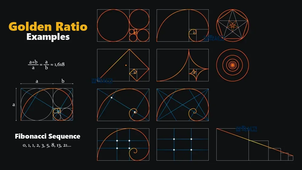
Proportion is used in practice across various design fields. A prominent example is the golden ratio. The golden ratio is approximately 1:1.618, is commonly found in nature, and is known for appealing to our aesthetic sense. Many designers use this ratio in logos, layouts, product designs, and other applications. Another example is adjusting proportions through a grid system. A grid system helps align and arrange design elements in a balanced way and provides a tool for managing proportions effectively.
Proportion in Functional Design
Proportion also plays an important role in the functional aspects of design. In web design, for example, the proportion between content and whitespace directly affects the user experience. Maintaining appropriate proportions makes it easier for users to access information and understand the content. The sizes and positions of buttons and navigation menus are also determined by proportion, contributing to the efficiency of the user interface.
Proportion and the Purpose of Design
Understanding proportion in design is not simply about pursuing visual beauty. It is an important tool for communicating the purpose and function of a design effectively. In advertising design, for example, appropriate proportions can emphasize important messages and guide the viewer's gaze in the desired direction. Proportion clarifies the hierarchy of information and helps users quickly find what they need.
Proportion and Maintaining Consistency
Finally, proportion plays an important role in maintaining consistency in design. Applying the same proportions to multiple design elements can give the overall design a unified, consistent feel. This is an important factor in strengthening brand identity and inspiring trust in users. Consistent use of proportion is essential to providing the same brand experience across different media and platforms.
The Golden Ratio and Its Applications: The Key to Harmonious Design

The History and Concept of the Golden Ratio
The golden ratio has been widely used in art and architecture from ancient Greece to the present day. This ratio is approximately 1:1.618 and is known for appearing frequently in nature. Examples of the golden ratio can easily be found in nature, including the arrangement of leaves, the spiral structure of seashells, and the proportions of the human body. These natural phenomena fit naturally with human visual perception, and applying them to design can create harmonious, balanced compositions.
The Golden Ratio in Layout Design
The golden ratio can be used effectively in layout design. When composing a page, setting the proportions of text, images, and whitespace according to the golden ratio can produce a visually appealing design with a sense of stability. This helps users focus more easily on the content and improves the efficiency of information delivery. For example, setting the widths of a web page's main content area and sidebar according to the golden ratio can create a balanced layout.
The Golden Ratio in Logo Design
The golden ratio also plays an important role in logo design. The logos of many famous brands were designed based on this ratio. Apple's logo uses the golden ratio to create a balanced, simple form. This contributes to strengthening brand identity and increasing users' visual satisfaction. Elements of the golden ratio can also be found in the logos of Nike, Facebook, and other brands. These logos convey visual consistency and professionalism while increasing brand recognition.
The Golden Ratio in Color Combinations
The golden ratio can also be applied to color combinations. Setting the proportions of the main and secondary colors according to the golden ratio creates harmony among colors and achieves visual balance. This improves the overall quality of the design and gives users a comfortable visual experience. In poster design, for example, adjusting the ratio between the areas occupied by the background color and the text color according to the golden ratio improves the communication of the message.
The Golden Ratio in Space Allocation
The golden ratio is also useful in allocating space. Setting the proportion between whitespace and content according to the golden ratio improves the readability and accessibility of a design. Appropriate whitespace helps users focus on the content and maintains consistency throughout the design. In print design in particular, adjusting the proportion between margins and the content area can create a professional, polished impression.
The Golden Ratio in Infographic Design
In infographic design, the golden ratio is also used to improve the visual presentation of information. Setting the proportion between data and graphic elements according to the golden ratio makes it possible to communicate complex information clearly and in an easy-to-understand way. Adjusting the sizes and placement of charts, icons, and other elements according to the golden ratio generates visual interest and maximizes the effectiveness of information delivery.
The Golden Ratio in Typography
In typography, the golden ratio is also used as a standard for adjusting font size, line spacing, letter spacing, and other settings. Setting the font sizes of headings and body text according to the golden ratio can create an easy-to-read text composition. This clearly communicates the importance of the content and gives the overall design a sense of unity.
The Golden Ratio in Product Design
In product design, the golden ratio is also used to pursue both balanced forms and functionality. Applying the golden ratio to the design of cars, electronic products, furniture, and other items can improve aesthetic quality and enhance the user experience. This becomes an important factor in increasing a product's competitiveness.
The Benefits and Limitations of the Golden Ratio
The golden ratio is a powerful tool that gives designs harmony and balance while increasing visual satisfaction. However, applying the golden ratio to every design is not always the best choice. Other proportions or composition methods may be more suitable depending on the design's purpose, target users, cultural background, and other factors. It is therefore important to use the golden ratio appropriately for the situation as one tool in design.
Grid Systems: Optimizing Layouts Through Proportion
The Concept and Importance of Grid Systems
A grid system is one of the tools that allows proportion to be used systematically in design. It refers to a structure for placing elements by dividing a page or screen with horizontal and vertical guidelines. Grid systems help organize layouts efficiently and adjust the proportions among elements in a balanced way. They play an important role in web design and print media design in particular and are useful for organizing complex information systematically.
Maintaining Design Consistency and Improving the User Experience
A grid system allows different elements to be arranged harmoniously while maintaining consistency in design. For example, distributing text, images, icons, and other elements in consistent proportions creates a balanced overall layout. This helps users understand the content and access information easily. Visual consistency improves the user experience and also contributes to strengthening the brand image.
Increasing Work Efficiency
A grid system is an efficient tool that can save time during the design process. Establishing a grid at the initial stage eliminates the need to continually adjust the proportions among elements during subsequent design work. This frees designers from repetitive adjustments and allows them to devote more time to creative work. Grid systems also make revisions and updates easier, improving the overall efficiency of a project.
Types of Grid Systems and How to Choose Them
Grid systems can take various forms. Common examples include column grids, modular grids, and baseline grids. A column grid divides a page along vertical lines to arrange elements, including the 12-column and 16-column grids commonly used in web design. A modular grid combines horizontal and vertical grids to allow more complex layouts. A baseline grid focuses on typography, enabling consistent text placement. These grids are selected according to the purpose and requirements of the design, and each has its own proportions.
Responsive Design and Grid Systems
Grid systems also play an important role in mobile design. They provide the flexibility to adjust proportions among elements to suit different screen sizes and resolutions. A fluid grid system uses a proportion-based layout to arrange elements flexibly according to the device's screen size. This gives users a consistent experience across different devices. This is a very important element of modern design.
Applications in Team Collaboration
Grid systems can also be useful in teamwork. Using the same grid system enables smooth collaboration among team members and helps maintain consistency in the results. When designers, developers, and content creators share the same standards, they can communicate efficiently and minimize errors. This is a particularly important factor in large-scale projects.
Considerations When Applying Grid Systems
There are several considerations for using a grid system effectively. First, the characteristics of the content should be understood so that an appropriate grid type can be selected. Second, excessive reliance on a grid system can make a design appear rigid, so flexibility is important. Third, whitespace and spacing should be adjusted appropriately to provide visual comfort. Balancing these elements makes it possible to create high-quality designs using a grid system.
Successful Applications of Grid Systems
Many examples of grid systems can be found on the websites of well-known media outlets and brands. Print publications such as The New York Times and Vogue use modular grids to organize complex information neatly. Apple's website uses a column grid to communicate product information intuitively. These examples show that grid systems can improve both the functionality and aesthetics of a design.
A grid system is a powerful tool that systematically manages proportion in design to improve the consistency and efficiency of layouts. Its various forms and applications allow it to be used in fields such as web, print, and mobile design. Using a grid system appropriately can improve the user experience, facilitate team collaboration, and enhance the quality of a design. It is an important element that cannot be overlooked in modern design.
The Influence of Proportion on Color Harmony: Finding Visual Balance

The Importance of Color Proportions
Proportion also plays an important role in color harmony. Adjusting the proportions among colors appropriately can maintain visual balance and improve the overall quality of a design. This is an important foundation for achieving harmony among visual elements and enables effective visual communication.
Basic Principles for Adjusting Color Proportions
One of the most basic ways to adjust color proportions is to balance the proportions of the main and secondary colors. In general, applying the 60-30-10 rule by allocating 60% to the main color, 30% to the secondary color, and 10% to the accent color creates a natural balance among colors. This plays an important role in achieving visual balance and gives the design a stronger sense of focus.
Strengthening Brand Identity and Color Proportions
Color proportions also play an important role in strengthening brand identity. Maintaining consistent proportions of a brand's main and secondary colors communicates a consistent brand image to users. This increases the brand's credibility and gives customers a professional, unified impression. Consistent color proportions are essential to maintaining brand consistency across different channels, including marketing materials, websites, and packaging.
Adjusting Color Proportions to Reduce Visual Fatigue
Color proportions also help reduce users' visual fatigue. If a particular color occupies an excessively large proportion, users may experience visual fatigue. Maintaining appropriate color proportions therefore helps users experience the design more comfortably. This contributes to increasing the time users spend on websites or applications and improving their satisfaction in particular.
Using a Color Harmony Wheel
Another way to adjust color proportions in design is to use a color harmony wheel. A color harmony wheel is a tool for visually adjusting the proportions among colors, making it easy to find a balance between them. Various color combinations, such as complementary colors, analogous colors, and triadic harmony, can be used to achieve consistent color harmony even in complex designs.
Communicating Emotion and Color Proportions
Color proportions also play an important role in communicating emotion. For example, adjusting the proportions of warm and cool colors can control the emotions a design conveys. Increasing the proportion of warm colors can create an energetic, passionate impression, while increasing the proportion of cool colors can create a calm, stable atmosphere. This serves as an important factor in optimizing the user experience.
Cultural Considerations and Color Proportions
Cultural background should also be considered when determining color proportions. Particular colors can have different meanings in different cultures, so these factors should be carefully reflected when adjusting color proportions. This is especially important in designs targeting a global market.
Color Proportions for Accessibility
Color proportions are also important for accessibility. Color contrast and proportions should be adjusted with users who have color blindness or visual impairments in mind. Providing sufficient contrast and communicating important information through elements other than color allows all users to interact with the design smoothly.
Successful Applications of Color Proportions
Well-known brands use color proportions strategically to build strong brand images. For example, Coca-Cola attracts attention by using its main color, red, boldly while positioning its secondary color, white, appropriately. Adjusting color proportions in this way increases brand recognition and enables product differentiation. Another example is IKEA, which uses the proportions of blue and yellow to communicate a friendly, trustworthy brand image.
Proportion is a key element in achieving visual balance and communicating emotion through color harmony. Maintaining appropriate color proportions can improve design quality and enhance the user experience. Various methods and tools for adjusting color proportions can be used to create effective designs, contributing to stronger brand identity and greater user satisfaction. We should continue to create better designs through a deeper understanding and creative application of color proportions.
Proportion is essential to achieving harmony and balance in design. Understanding its basic concept and applying it to different design elements makes it possible to create designs of higher quality. Various approaches to using proportion, including the golden ratio, grid systems, and color proportions, can improve both the functionality and aesthetic quality of a design.
This approach provides users with a more satisfying experience and contributes to achieving the purpose of a design effectively. We hope that a deeper understanding and creative application of proportion will continue to lead to even better designs.