Gradient design is an important design technique that creates visually appealing effects through subtle changes in color and tone. This technique can be used in various fields and plays a major role in adding depth to designs and improving the user experience.
This material explores the principles and basic concepts of gradient design, different gradient types and selection criteria, the advantages and disadvantages of using gradients, and practical tips for effective gradient design in detail.
The Principles and Basic Concepts of Gradients
 What Is a Gradient?
The Definition and Importance of Gradients
Gradient design refers to continuous changes in color or tone. It provides visual smoothness through natural transitions between two or more colors. These changes go beyond simply blending colors and play an important role in creating harmony and balance throughout a design. Gradients can involve not only color but also various other elements, such as brightness, opacity, and saturation.
The Relationship Between Color Theory and Gradients
The foundations of gradient design are based on color theory. Color theory is the study of relationships between colors and how they are perceived visually. Understanding basic color theory is essential for using gradients effectively. For example, using complementary colors can produce a strong contrast, while using analogous colors can create smooth, natural transitions.
The Importance of Gradient Direction
The direction of a gradient is also an important factor. Gradients can be applied in various directions, including horizontal, vertical, diagonal, and radial. Each direction produces a different visual effect, and it is important to choose an appropriate direction according to the design's purpose and background. For example, horizontal gradients create a sense of spaciousness, while radial gradients emphasize a central point.
Gradient Intensity and Range
The intensity and range of a gradient are also factors to consider. Strong gradients produce noticeable visual effects, but excessive use can make a design complex. In contrast, subtle gradients produce soft, understated effects but may be less noticeable. It is therefore important to adjust the intensity and range appropriately according to the design's purpose and the environment in which it is used.
Gradients and User Experience (UX)
Gradient design is also closely related to user experience (UX). A well-designed gradient can guide the user's gaze, emphasize important information, and improve the overall user experience. Conversely, poorly used gradients can confuse users. It is therefore necessary to understand the role and importance of gradients in UX design.
The Importance of Practice and Experience
Finally, practice and experience are important for successfully applying gradient design. You can develop your own style by trying different color combinations and gradient techniques. This allows you to apply the basic principles and concepts of gradient design effectively to real projects.
Different Gradient Types and Selection Criteria
 What Types of Gradients Are There?
Linear Gradient (Linear Gradient)
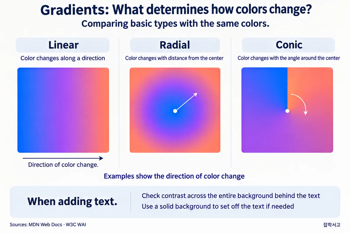
There are several types of gradients in gradient design. The most basic of these is the linear gradient (linear gradient). A linear gradient changes colors along a straight line between two points and is both the most fundamental and a widely used type. It can be applied in various directions, including horizontal, vertical, and diagonal, and can be used in everything from simple to complex designs.
Radial Gradient (Radial Gradient)
Next is the radial gradient (radial gradient). A radial gradient refers to a color transition that starts at a point and spreads outward. It is effective for emphasizing a central point or creating circular patterns. Radial gradients are commonly used in logo design, background graphics, and icons.
Conical Gradient (Conical Gradient)
A conical gradient (conical gradient) is a type in which colors change clockwise or counterclockwise around the center of a circle. This type can be used to emphasize a particular visual effect or theme. Conical gradients are commonly used in data visualizations such as graphs, charts, and diagrams.
Multiple Gradient (Multiple Gradient)
Multiple gradients (multiple gradient) are a technique that combines two or more gradients. This can create complex color transitions and a variety of visual effects. Multiple gradients are particularly common in web design and UI/UX design, helping add depth and sophistication to user interface elements.
Noise Gradient (Noise Gradient)
A noise gradient (noise gradient) is a type that adds texture and noise to color transitions. It can create a natural, organic feel and is often used in background design and artwork. Noise gradients are particularly useful when a natural effect is desired.
Criteria for Choosing a Gradient Type
When choosing a gradient type, you should consider the design's purpose and the environment in which it will be used. For example, radial or conical gradients can be used to emphasize brand identity. In contrast, multiple gradients or noise gradients can be chosen to enhance the depth and aesthetic value of website backgrounds or app interfaces.
Analyzing the Advantages and Disadvantages of Using Gradients
 Sample Gradient Color Combinations
Gradients are a powerful tool for adding visual interest and depth to designs. However, when using gradients, it is important to understand their advantages and disadvantages and use them appropriately on that basis.
Advantages of Using Gradients
1. Increasing Visual Interest and Appeal
Gradients provide more visual interest than a single color. Smooth changes in color add life to a design and make it more likely to catch the eye. This makes them effective for attracting users' attention and emphasizing important elements.
2. Adding Depth and Dimension
Gradients add depth and dimension to flat designs. Changes in color create a sense of volume and can produce a 3D effect, making a design appear richer and more complex. These effects play a particularly important role in website backgrounds and app interfaces.
3. Smooth Transitions and Harmony
Using gradients allows you to connect two or more colors smoothly. This helps create harmony in a design and provides a smooth visual flow as the colors connect naturally. This allows users to perceive and understand the design more easily.
4. A Modern, Sophisticated Feel
Gradients are one of the trends in modern design, creating a sophisticated, stylish feel. Many newer brands and apps use gradients to build a modern image, which can help establish a youthful, energetic brand identity.
Disadvantages of Using Gradients
1. Visual Fatigue Caused by Excessive Use
Excessive use of gradients can make a design complex and confusing. In particular, multiple gradients or gradients with strong contrast can cause visual fatigue and carry the risk of making users overlook important information.
2. Difficulty Choosing Colors
Color selection is an important aspect of gradients, but finding an appropriate color combination can be difficult. Poor color combinations can undermine a design's consistency and cause visual discomfort. This can be a major challenge for designers who lack an understanding of color theory and experience.
3. Complexity of Technical Implementation
There can be technical difficulties in implementing gradients. In particular, maintaining consistent gradient effects across different resolutions and devices is difficult. In web design, browser compatibility and performance issues must also be considered.
4. Accessibility Issues
If gradients are used incorrectly, they can cause confusion for people with color vision deficiencies (color blindness). If gradients are used without considering lightness and saturation, important information may not be communicated properly. Gradient design that takes accessibility into account is therefore necessary.
Tips for Making the Best Use of Gradients
1. Using a Limited Number of Colors
When using gradients, it is advisable to use a limited color palette. Use two or three colors to create harmony and maintain consistency in the design.
2. Emphasizing Important Elements
You can use gradients on important elements to emphasize them. For example, apply gradients to elements that need to attract users' attention, such as buttons or banners.
3. Testing and Feedback
You should test different color combinations and gradient directions to find the best design. Evaluate the design's effectiveness through user feedback and adjust it as needed.
Gradients offer many advantages in design, but they also come with disadvantages and challenges. By understanding these well and using gradients appropriately, you can create more effective and beautiful designs.
Practical Tips for Effective Gradient Design
 What Is Important When Using Gradients?
The Importance of Color Selection
It is important to remember a few practical tips for effective gradient design. First, choose colors carefully. If a gradient's color combination is inappropriate, the design may look confusing. It is therefore important to choose harmonious color combinations based on color theory. For example, using colors with similar tones can create smooth, natural transitions.
You can also use color palette generation tools such as Adobe Color and Coolors to create and experiment with different color palettes, and refer to brand guidelines to maintain consistency. After trying different color combinations, it is important to obtain feedback from users or team members and choose the best combination.
Adjusting Gradient Intensity and Range
Second, it is important to adjust the intensity and range of a gradient. Strong gradients can increase focus, but excessive use can be visually overwhelming. In contrast, subtle gradients can create a sophisticated, understated feel but may be less noticeable. It is therefore necessary to choose an appropriate intensity and range for the design's purpose.
Fine-tune the gradient to precisely adjust the intensity of the color combination, and add transparency at the end of the gradient to create a smooth transition. You can also increase focus by applying strong gradients only to important design elements.
Considering Gradient Direction
Third, you should consider the direction of the gradient. Gradients can be applied in various directions, including horizontal, vertical, diagonal, and radial. Each direction produces a different visual effect, and it is important to choose an appropriate direction according to the design's purpose and background. For example, horizontal gradients create a sense of spaciousness, while radial gradients emphasize a central point.
You can also use gradient direction to guide the user's gaze in the desired direction and set the direction with different device sizes and proportions in mind. Combining gradient direction with animation can create dynamic visual effects.
Using Multiple Gradients
Fourth, try using multiple gradients. Multiple gradients combine two or more gradients to create complex, rich color transitions. This is particularly effective for adding depth and sophistication to background designs and web pages. When using multiple gradients, take care to ensure that transitions between colors are natural.
Use layer masks and multiple layers to implement multiple gradients, and apply different blending modes to create unique effects. It is important to adjust multiple gradients according to the context of the design elements.
Adding Texture and Noise
Fifth, you can add texture and noise to create a natural effect. Noise gradients add texture and noise to simple color transitions, creating a more organic, natural feel. This can be particularly useful in background design and artwork. You can overlay a texture image on a gradient to add a distinctive texture, or use a noise filter in graphics software to add subtle noise to the gradient.
Another method is to use a brush tool to add texture and noise manually for a more natural feel.
Practical Testing and Feedback
It is important to understand the characteristics of each gradient type and choose a type that matches the design's purpose. A process of testing different gradients in practice to find the best effect is necessary. You can develop your own style by trying different color combinations and gradient types. This allows you to apply the basic principles and concepts of gradient design effectively to real projects.
Also, create prototypes, test them in real environments, and collect feedback to improve the design. It is important to keep learning about the latest design trends and techniques and update your gradient designs accordingly.
Gradient design goes beyond simple color transitions and is an important technique for enhancing the aesthetic value of an entire design and improving the user experience.
We hope that the basic concepts, different types, advantages and disadvantages of gradients, and practical tips covered in this material will help you implement effective gradient designs.
We look forward to seeing you create original, captivating work through gradient design.