
You open a newly downloaded app for the first time, tap a button, and nothing happens. Do you tap again or wait? Or you accidentally delete a photo and can’t see any way to get it back. That sinking frustration is familiar, and screens that are hard to use tend to fail for common reasons. An answer in the form of ten criteria is “Nielsen’s Usability Heuristics (10 Usability Heuristics for User Interface Design).”
Simply put, Nielsen’s usability heuristics are “ten rules of thumb for judging whether a screen is easy and comfortable for users.” A heuristic is not a detailed, step-by-step guideline but a rough guide. The Danish-born usability expert Jakob Nielsen first created them in 1990 together with Rolf Molich, and the list he refined in 1994 is still used today in the same form.
In this article, we will look in turn at the background from which the heuristics emerged, the ten principles, examples to look for in everyday life, and finally the evaluation method built on them and its limits.
Ten Criteria for an Easy-to-Use Screen
The Birth of Heuristic Evaluation

The surest way to check usability is to bring in real users and have them try the product. But this takes a lot of time and money, so small teams often can’t do it regularly.
(1) A cheap, quick way to check
In 1990, Nielsen and Molich proposed “heuristic evaluation,” in which a few experts examine a screen against a set of established principles. Because you don’t need to gather users, problems can be found at low cost.
(2) The 1994 refinement
In 1994, Nielsen analyzed 249 usability problems that had actually been found and picked out the ten principles that explained them best. The descriptions and examples were expanded in 2020, but the principles themselves did not change.
(3) Evaluation that works even on paper
Evaluators don’t perform real tasks; they only examine the screen, so even paper designs that haven’t been built yet can be checked. That makes the method especially useful early in development.
The Ten Principles

The ten principles Nielsen proposed are as follows.
- Visibility of System Status: Tell users what is happening right now, at the right time.
- Match Between the System and the Real World: Use words and an order that users know instead of technical jargon.
- User Control and Freedom: Provide a way to undo a mistaken action or an emergency exit.
- Consistency and Standards: Use the same words and look for the same meaning, and follow industry conventions.
- Error Prevention: Remove conditions where mistakes are likely, or ask for one more confirmation before acting.
- Recognition Rather than Recall: Keep the needed information and menus visible so users have less to remember.
- Flexibility and Efficiency of Use: Offer shortcuts and customization for experienced users.
- Aesthetic and Minimalist Design: Don’t let unnecessary information hide what matters.
- Help Users Recognize, Diagnose, and Recover from Errors: Explain the problem and the fix in plain words instead of error codes.
- Help and Documentation: Offer short, specific guidance that is easy to find when needed.
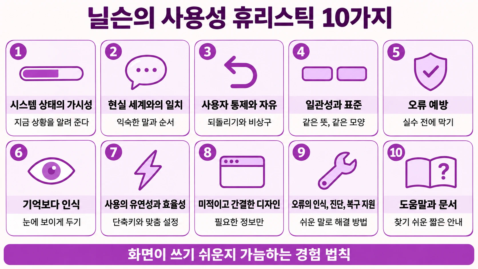
Heuristics to Find in Everyday Life

These principles are easy to find in everyday objects and spaces beyond the screen.
The “You Are Here” Mark on a Mall Map
The “you are here” mark on a big shopping mall map tells you where you are, which helps you decide where to go next. It is a good example of the first principle, visibility of system status.
Stove Knobs Laid Out Like the Burners
On a stove whose knobs are arranged in the same shape as its burners, you can tell right away which knob lights which burner. That is the convenience of matching the real world.
Guardrails on a Mountain Road
A guardrail on a winding mountain road prevents a car from plunging off a cliff in the first place. It reflects the idea behind error prevention: it is better to stop a mistake from the start than to fix it after it happens.
Evaluation Methods and Limits

Heuristic evaluation is highly efficient, but there are a few things to know in order to use it well.
(1) Three to five evaluators
Averaging across Nielsen’s many cases, a single evaluator found only about 35% of the problems. Because each person finds different problems, the usual approach is to have each person review separately and then combine the results, and three to five evaluators are generally recommended.
(2) It doesn’t tell you how to fix things
This evaluation points out which principle was violated, but exactly how to fix it, or whether a new design is better, has to be judged separately.
(3) It can’t replace user testing
Problems found through experts’ eyes may differ from the ones real users run into. So heuristic evaluation is regarded as a complementary tool used before and after user testing.
Nielsen’s usability heuristics have been used almost unchanged for over thirty years, which shows they are criteria that hold even as screens change. Today they serve as a basic checklist when designing not only apps and websites but also virtual reality, games, and kiosks.
Before releasing a new screen, first ask whether users can tell what they are doing right now and whether they can undo a mistake. That is the first step toward easy-to-use design.