Have you ever bought just one item at an online store only to find an insurance product quietly added to your cart, or signed up for a one-month free trial and then kept paying for months because you couldn’t find the cancel button? It may look like a mistake, but very often the screen was carefully designed to make users act exactly that way. The name for this kind of design is “Dark Patterns.”
Put simply, a dark pattern means “a design that uses screen layout, color, and wording to trick or push users into actions they would not have taken if they had properly understood or been able to choose.” In Korea it is also called “online deceptive sales tactics,” and it has now gone beyond design ethics to become a matter handled by law.
In this article, we will look in turn at the background of how the term dark patterns came about, their typical types, cases that paid a heavy price, and finally Korea’s regulations and the principles of honest design.
How Screens That Deceive Users Work, and How to Respond
Where Did Dark Patterns Come From?

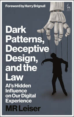
The term dark patterns was first coined in 2010 by British user experience (UX) designer Harry Brignull. In the design field there is the term “design pattern,” meaning a proven solution that solves a frequently occurring problem well. Brignull noticed that, conversely, solutions deliberately built to deceive and manipulate users also repeat like patterns, and he gave them this name to convey that they hide in the shadows and are hard to spot.
That same year he opened a website that collected and publicized examples, and organized 12 representative types. The site later changed its name, and Brignull himself now prefers the expression “Deceptive Patterns.” However, the term dark patterns is still widely used in law and research.
What makes dark patterns frightening is that users often don’t even realize they have been deceived. Most people just shrug it off thinking “I must have clicked the wrong thing,” so even if the harm to each person is small, gathered from huge numbers of people it becomes a large profit for companies.
Typical Types of Dark Patterns
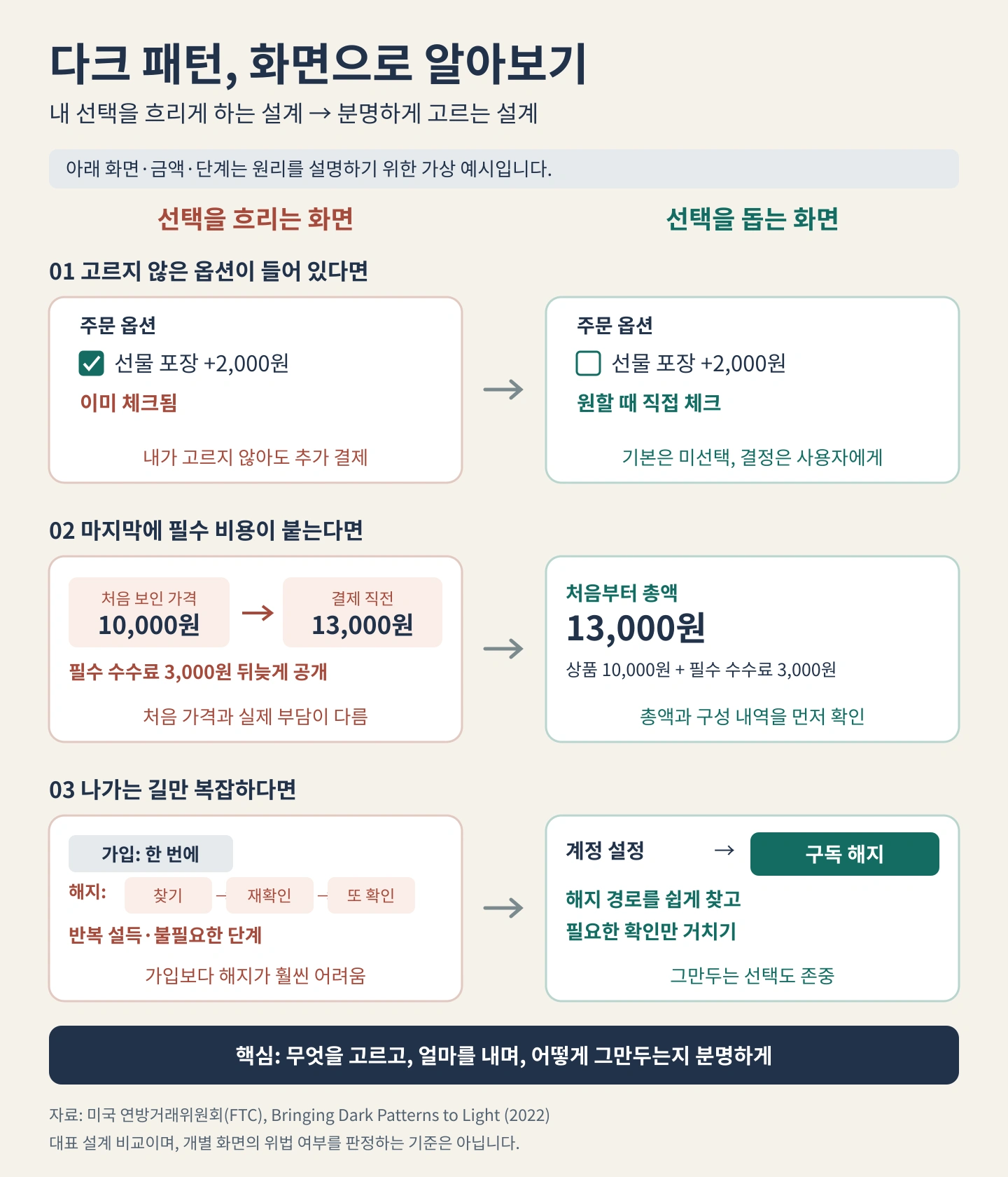
Dark patterns come in many shapes, but they can be grouped into a few common tricks.
- Roach Motel: Signing up takes a single button, but canceling requires a phone call and several stages of confirmation screens, wearing people down until they give up.
- Sneak into Basket: Products or options the user did not choose are pre-checked so they slip into the payment.
- Hidden Costs: Only a low price is shown at first, and fees and shipping costs are added only at the last step of checkout.
- Confirmshaming: Wording such as “No, I’d rather lose out” is put on the decline button to make people who refuse feel ashamed.
- Disguised Ads: Ads are dressed up as articles or download buttons to get people to click them.
- Forced Continuity: When a free trial ends, it moves straight to paid billing without separate notice, so people miss the time to cancel.
Drawing the Eye Elsewhere
Another common trick is to make the desired button large and flashy and the decline button small with faint text. Because users press whatever stands out first rather than reading the screen carefully, even such small differences can change their choices a great deal.
Dark Pattern Cases That Paid the Price

A case that shows how big a problem dark patterns can become is the Amazon Prime membership case in the United States. In 2023, the U.S. Federal Trade Commission (FTC) sued Amazon, alleging that it used confusing screens to enroll consumers in Prime membership and deliberately made canceling difficult by forcing users through multiple pages and repeated confirmations.
A Maze to Block Cancellation
Inside Amazon, this cancellation process was called “Iliad,” after the long epic poem of ancient Greece. In September 2025, Amazon ultimately agreed to pay a total of 2.5 billion dollars: a 1 billion dollar civil penalty and 1.5 billion dollars in consumer refunds. It also agreed to display a clear decline button and to let people cancel easily using the same method they used to sign up. The case became a leading example showing that dark patterns can go beyond a mere marketing technique and be judged as illegal conduct.
Korea’s Regulations and Honest Design

Korea, too, has regulated six kinds of dark patterns since February 14, 2025, when the amended Electronic Commerce Act took effect.
(1) Hidden Renewal and Drip Pricing
When a free trial switches to paid or a subscription charge goes up, separate consent must be obtained from the consumer. In addition, the total amount that must be paid has to be displayed on the screen where the price is first shown, such as search results.
(2) Preselection and False Hierarchy
Pre-checking an item to buy another product, or making big differences in the size, shape, or color of choice buttons to steer people toward the option that favors the business, is prohibited.
(3) Obstructing Cancellation or Withdrawal, and Nagging
Making the cancellation process far more complicated than signing up, or repeatedly asking again through pop-up windows about a choice that has already been declined, is also prohibited. Violations can bring sanctions such as corrective orders and administrative fines.
The European Union (EU) also included a provision in its 2022 Digital Services Act that bars online platforms from designing screens that deceive or manipulate users, and regulation is growing fast around the world.
The lesson for designers is simple. Make the exit as easy as the entrance, and have buttons honestly tell people what will happen when they press them.
Dark patterns can boost sign-ups and sales in the short term, but users who realize they were deceived do not trust the brand again. As regulation tightens, the legal risk has now grown as well. Good design is not a screen that holds users longer, but one that helps users finish what they want to do easily and clearly.
Letting users choose for themselves without deceiving them is the first step toward design that earns trust for a long time.