When you drag a file onto the trash icon on a smartphone screen, you hear the sound of crumpling paper. When you take a photo with the camera app, you hear a ‘click’ even though there is no shutter. Thanks to touches like these that imitate real objects, we can handle devices we have never seen before without feeling lost. This way of dressing something new in the look of an old object is called ‘Skeuomorphism.’
Put simply, skeuomorphism means ‘design that keeps a shape or texture that was essential in the original object as a kind of decoration on a new product that no longer needs it for function, so the product looks familiar.’ On digital screens, it became widely known for drawing in real materials such as leather, wood and paper, along with a sense of depth.
In this piece, we will look in turn at the meaning and origins of skeuomorphism, examples in everyday life and on screens, its debate with flat design, and the traces it has left on design today.
Design That Borrows the Look of Old Objects
What Is Skeuomorphism?
The word skeuomorph combines the Greek skeuos, meaning ‘vessel or tool,’ and morphē, meaning ‘shape.’ It came into use in archaeology and the crafts in the late 19th century.
(1) The Function Disappears, the Shape Remains
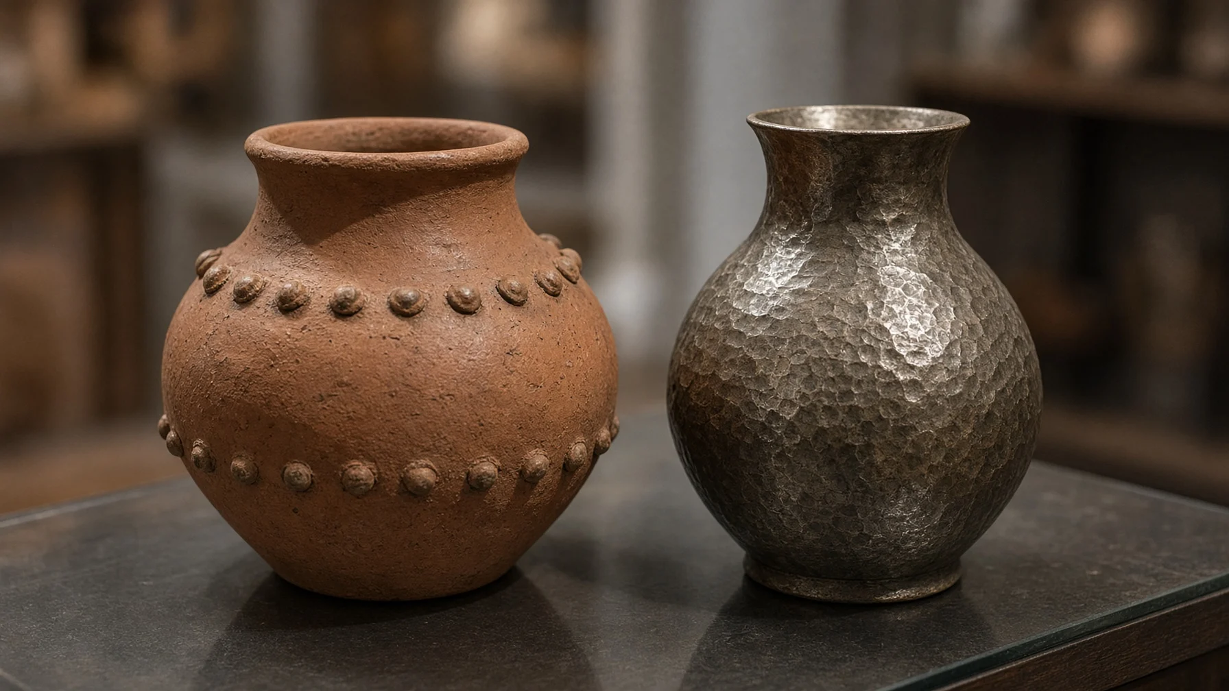
A skeuomorph refers to an element that was essential in the original structure but survives only as appearance after the material or technology has changed. A classic example is ancient pottery made to copy metal vessels, with the rivets reproduced as small lumps of clay.
(2) A Bridge Called Familiarity
Such decorations may look useless, but they signal to people, ‘This is the thing I know.’ Cognitive scientist and designer Donald Norman observed that skeuomorphism offers comfort and makes things easier to learn during the move to a new technology.
Skeuomorphism in Everyday Life and on Screens
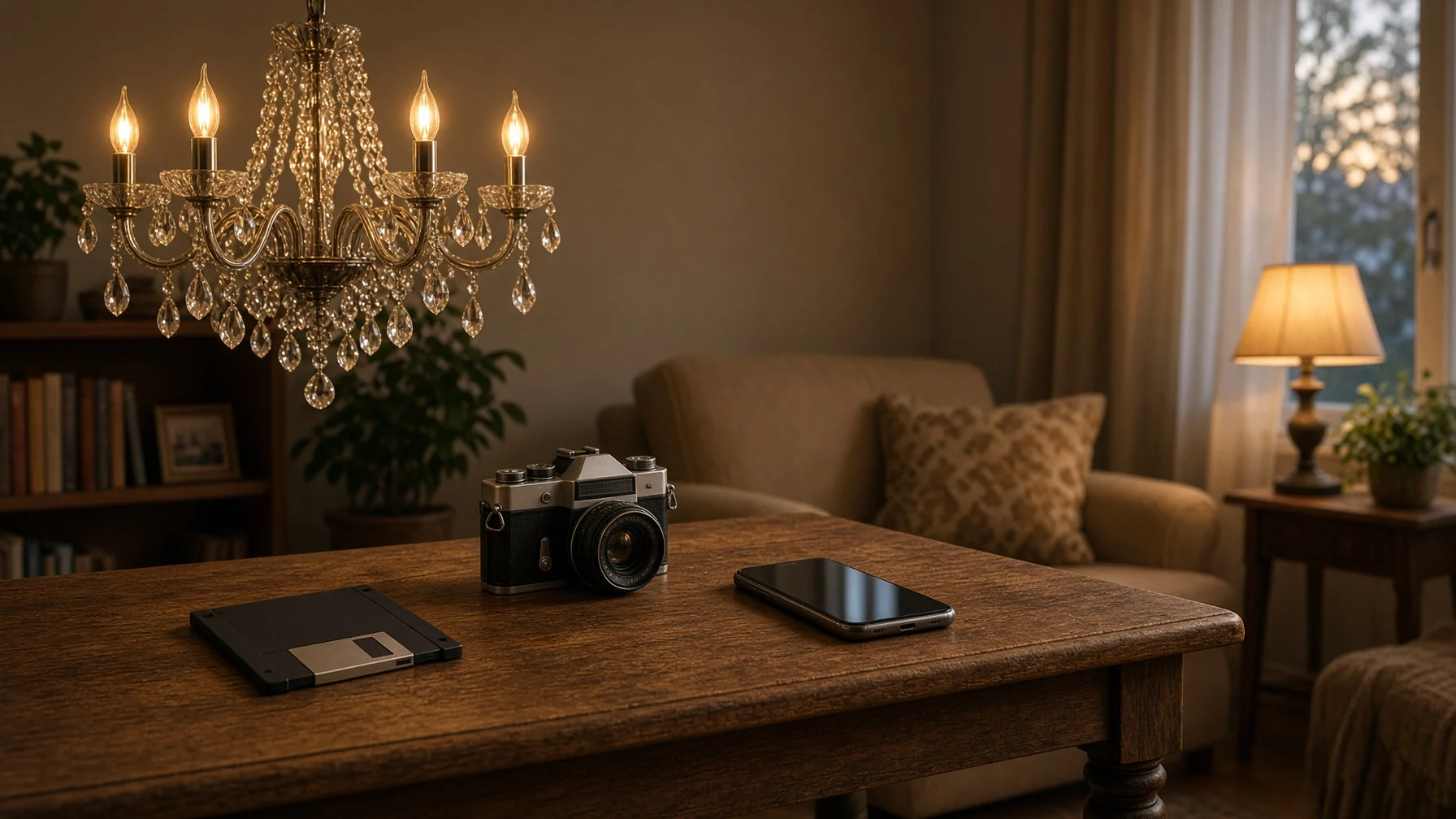
Skeuomorphism has been hiding everywhere, from ancient architecture and crafts all the way to today’s software.
- Greek temples (Doric Order): The triglyphs on stone Doric temples are thought to recreate in stone the beam ends and wooden pegs of earlier timber temples.
- Candle bulbs (Candle Bulb): Bulbs that need no flame are shaped like candles to keep the old atmosphere of a chandelier.
- The desktop (Desktop Metaphor): The computer screen is set up like a desk, and files are shown as pictures of paper folders.
- The save icon (Floppy Disk Icon): Even now that floppy disks are no longer used, the ‘Save’ button still shows a picture of a disk.
- Sound effects (Auditory Skeuomorph): The shutter sound of a mobile phone and the artificial engine sound of an electric car are skeuomorphs made of sound.
There are traces in the history of the automobile too. Norman pointed out that early cars were designed after horse-drawn carriages, and in 1899 there was even a car called the ‘Horsey Horseless,’ which had a wooden horse’s head mounted on the front so that real horses would not be startled.
The Debate Between Skeuomorphism and Flat Design
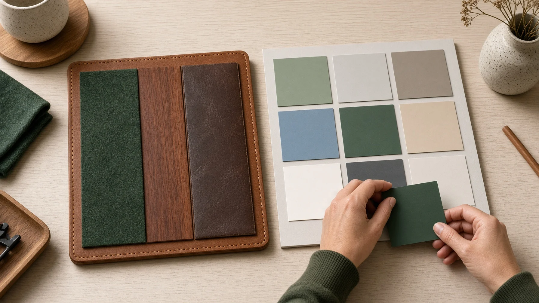
On digital screens, skeuomorphism flourished most lavishly at Apple in the Steve Jobs era.
[Case 1] An iPhone Dressed in Leather and Wood
Apps on the early iPhone and iPad looked as if real objects had been moved straight onto the screen. The notes app looked like a yellow lined notepad, the e-book app like a wooden bookshelf, and the games app like a table covered in green felt. At a time when touchscreens were unfamiliar, this look helped even first-time users easily guess what each feature did.
[Case 2] iOS 7 and the Flattened Screen
In 2012, Scott Forstall, who had led this design style, left the company, and designer Jonathan Ive, who disliked such decoration, took charge of software design. iOS 7, unveiled the following year in 2013, put forward a flat screen stripped of textures and shadows, and the press called it ‘the death of skeuomorphism.’
Critics pointed out that decorations imitating real objects take up a lot of screen space, hurt consistency because every app looks different, and after a few uses only add visual noise. On the other hand, research suggests that icons resembling real objects are easier to recognize than abstract icons and can help people learn a screen quickly.
The Traces and Balance Skeuomorphism Left Behind
Even after flat design became the mainstream, skeuomorphism did not disappear completely. Instead, it changed into subtler forms that remain all over today’s screens.
(1) The Return of Subtle Depth
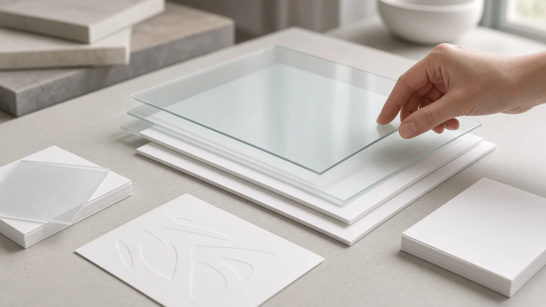
Material Design, which Google announced in 2014, uses thin layers and shadows modeled on paper and ink to show which elements sit above or below others on the screen. Around 2020, ‘Neumorphism,’ which makes the screen look as if it softly rises up, became a trend, and in 2025 Apple introduced its ‘Liquid Glass’ design with a see-through, glass-like texture.
(2) Keeping Meaning Rather Than Imitation
Good skeuomorphism does not stop at copying a shape as it is. The key is to keep only the cues that tell users what they can press and what state something is in, and to strip away unnecessary decoration. In this sense, skeuomorphism and flat design are less opponents than a question of finding the right point between familiarity and simplicity.
Skeuomorphism is design that borrows the look of old objects to make unfamiliar technology feel friendly. As people grow used to a new tool, the decoration fades, and only the essential signals remain to become new conventions—just as a generation that has never seen a floppy disk still recognizes the save icon.
Starting from what users already know and keeping only the cues that are truly needed: that is the first step toward easy design.